Hanzii Redesign: Drive sustainable growth by aligning revenue & retention

Descriptions
Hanzii Dict is a comprehensive Chinese dictionary application tailored for HSK/TOCFL candidates.
Offering essential features including translating, notebook, exam preparation and community.
Problems
The product was hard-coded without design files, which made design changes harder to implement.
The interface was clutter & couldn’t keep up with Hanzii’s growth speed.
The original UI was inconsistent & couldn't handle the complexity of new features in our roadmap.
Hanzii Redesign: Drive sustainable growth by aligning revenue & retention
Descriptions
Hanzii Dict is a comprehensive Chinese dictionary application tailored for HSK/TOCFL candidates.
Offering essential features including translating, notebook, exam preparation and community.
Problems
The product was hard-coded without design files, which made design changes harder to implement.
The interface was clutter & couldn’t keep up with Hanzii’s growth speed.
The original UI was inconsistent & couldn't handle the complexity of new features in our roadmap.
Hanzii Redesign: Drive sustainable growth by aligning revenue & retention
Descriptions
Hanzii Dict is a comprehensive Chinese dictionary application tailored for HSK/TOCFL candidates.
Offering essential features including translating, notebook, exam preparation and community.
Problems
The product was hard-coded without design files, which made design changes harder to implement.
The interface was clutter & couldn’t keep up with Hanzii’s growth speed.
The original UI was inconsistent & couldn't handle the complexity of new features in our roadmap.
Product Life Cycle
The product experienced a steady upward trend in revenue, new users & active users, confirming its official entry into the Growth stage. However, after analyzing UX metrics via GA4, I found out that both user retention & daily engagement faced a consistent decline over the six-month period from July 2023 to December 2023.

Introduction
Growth
Maturity
Decline
+9.2%
Average monthly revenue growth confirmed Hanzii was entering its Growth stage
~200K
New users/month confirmed we were consistently reaching new people
+22.5%
Growth in active users, proved that the product was scaling its reach.
However...
-14%
Decline in D1 Retention signaled a difficulty in keeping new users engaged
-23%
Drop in stickiness eventually led DAU/MAU falling below the 22% Edtech benchmark
While revenue confirms a Growth stage, declining retention & stickiness signal unsustainable development. This can prevent Hanzii from reaching its full potential
Product Life Cycle
The product experienced a steady upward trend in revenue, new users & active users, confirming its official entry into the Growth stage. However, after analyzing UX metrics via GA4, I found out that both user retention & daily engagement faced a consistent decline over the six-month period from July 2023 to December 2023.
Introduction
Growth
Maturity
Decline
+9.2%
Average monthly revenue growth confirmed Hanzii was entering its Growth stage
~200K
New users/month confirmed we were consistently reaching new people
+22.5%
Growth in active users, proved that the product was scaling its reach.
However...
-14%
Decline in D1 Retention signaled a difficulty in keeping new users engaged
-23%
Drop in stickiness eventually led DAU/MAU falling below the 22% Edtech benchmark
While revenue confirms a Growth stage, declining retention & stickiness signal unsustainable development. This can prevent Hanzii from reaching its full potential
Product Life Cycle
The product experienced a steady upward trend in revenue, new users & active users, confirming its official entry into the Growth stage. However, after analyzing UX metrics via GA4, I found out that both user retention & daily engagement faced a consistent decline over the six-month period from July 2023 to December 2023.
Introduction
Growth
Maturity
Decline
+9.2%
Average monthly revenue growth confirmed Hanzii was entering its Growth stage
~200K
New users/month confirmed we were consistently reaching new people
+22.5%
Growth in active users, proved that the product was scaling its reach.
However...
-14%
Decline in D1 Retention signaled a difficulty in keeping new users engaged
-23%
Drop in stickiness eventually led DAU/MAU falling below the 22% Edtech benchmark
While revenue confirms a Growth stage, declining retention & stickiness signal unsustainable development. This can prevent Hanzii from reaching its full potential
Objective & Approach
1. Primary goal
Drive sustainable growth by ensuring both revenue & retention increase simultaneously through a more intuitive & structured interface.
2. What to do
Conduct both primary & secondary research to identify the root causes of declining user retention decline in retention & stickiness, despite the app’s strong revenue & market growth.
Propose evidence-based solutions to optimize core features, ensuring the interface is organized & ready for future expansion.
Objective & Approach
1. Primary goal
Drive sustainable growth by ensuring both revenue & retention increase simultaneously through a more intuitive & structured interface.
2. What to do
Conduct both primary & secondary research to identify the root causes of declining user retention decline in retention & stickiness, despite the app’s strong revenue & market growth.
Propose evidence-based solutions to optimize core features, ensuring the interface is organized & ready for future expansion.
Objective & Approach
1. Primary goal
Drive sustainable growth by ensuring both revenue & retention increase simultaneously through a more intuitive & structured interface.
2. What to do
Conduct both primary & secondary research to identify the root causes of declining user retention decline in retention & stickiness, despite the app’s strong revenue & market growth.
Propose evidence-based solutions to optimize core features, ensuring the interface is organized & ready for future expansion.
Design Process
We adopted the Double Diamond process to navigate this project, moving from broad exploration to focused execution. This structured approach ensured that we deeply understood the root causes of declining retention before designing the right solutions.

My role
Research & Strategy: Conducted primary & secondary research to identify root causes, then brainstormed high-impact solutions.
Execution & Scalability: Designed high-fidelity UI & built a comprehensive Design System from scratch.
No time for lengthy process?
Design Process
We adopted the Double Diamond process to navigate this project, moving from broad exploration to focused execution. This structured approach ensured that we deeply understood the root causes of declining retention before designing the right solutions.
My role
Research & Strategy: Conducted primary & secondary research to identify root causes, then brainstormed high-impact solutions.
Execution & Scalability: Designed high-fidelity UI & built a comprehensive Design System from scratch.
No time for lengthy process?
Design Process
We adopted the Double Diamond process to navigate this project, moving from broad exploration to focused execution. This structured approach ensured that we deeply understood the root causes of declining retention before designing the right solutions.
My role
Research & Strategy: Conducted primary & secondary research to identify root causes, then brainstormed high-impact solutions.
Execution & Scalability: Designed high-fidelity UI & built a comprehensive Design System from scratch.
No time for lengthy process?
Secondary Research
Review mining
Systematically analyzed hundreds of user feedback from the App Store, Google Play & customer support logs to uncover recurring pain points & unmet needs, allowing us to validate our challenges.
The interface feels overwhelming and cluttered
The typography is hard to read
The app looks outdated and old-fashioned
Long sentences are usually translated poorly
I wanna actually practice and memorize new words
Need AI support for pronunciation and translation
Secondary Research
Review mining
Systematically analyzed hundreds of user feedback from the App Store, Google Play & customer support logs to uncover recurring pain points & unmet needs, allowing us to validate our challenges.
The interface feels overwhelming and cluttered
The typography is hard to read
The app looks outdated and old-fashioned
Long sentences are usually translated poorly
I wanna actually practice and memorize new words
Need AI support for pronunciation and translation
Secondary Research
Review mining
Systematically analyzed hundreds of user feedback from the App Store, Google Play & customer support logs to uncover recurring pain points & unmet needs, allowing us to validate our challenges.
The interface feels overwhelming and cluttered
The typography is hard to read
The app looks outdated and old-fashioned
Long sentences are usually translated poorly
I wanna actually practice and memorize new words
Need AI support for pronunciation and translation
Primary Research
Design audit
Based on UX heuristics & heatmap test to evaluate Hanzii’s interface. By categorizing findings into 4 categories (Good - Needs improvement - Needs to be fixed - Idea), we can better understand & prioritize critical issues.

Several usability & interface issues
High Cognitive Load
Cluttered content & small text make the interface hard to scan & read.
Visual Mismatch
Illustrations & icons fail to support the intended meaning, further confusing the user.
Weak Hierarchy
Makes it difficult for users to distinguish between primary & secondary features.
Style Inconsistency
Inconsistent spacing, color & styles creates a fragmented layout.
User interview
While secondary research provided a broad market overview, it failed to capture the 'why' behind user behavior. In that case, in-depth interviews to uncover the hidden pain points & motivations, allowing me to transform surface-level observations into actionable design insights.
Translation lacks natural context
Cluttered information, hard to find specific features
The content amount is huge and solid
Love the data, but it's hard to find the meaning part quickly
I love how it instantly shows search results
I search then forget, no system to learn
6/8
Users struggled to find what they needed on the home screen
7/8
Users switch to external tools like ChatGPT for long sentences due to poor translation quality
Primary Research
Design audit
Based on UX heuristics & heatmap test to evaluate Hanzii’s interface. By categorizing findings into 4 categories (Good - Needs improvement - Needs to be fixed - Idea), we can better understand & prioritize critical issues.
Several usability & interface issues
High Cognitive Load
Cluttered content & small text make the interface hard to scan & read.
Visual Mismatch
Illustrations & icons fail to support the intended meaning, further confusing the user.
Weak Hierarchy
Makes it difficult for users to distinguish between primary & secondary features.
Style Inconsistency
Inconsistent spacing, color & styles creates a fragmented layout.
User interview
While secondary research provided a broad market overview, it failed to capture the 'why' behind user behavior. In that case, in-depth interviews to uncover the hidden pain points & motivations, allowing me to transform surface-level observations into actionable design insights.
Translation lacks natural context
Cluttered information, hard to find specific features
The content amount is huge and solid
Love the data, but it's hard to find the meaning part quickly
I love how it instantly shows search results
I search then forget, no system to learn
6/8
Users struggled to find what they needed on the home screen
7/8
Users switch to external tools like ChatGPT for long sentences due to poor translation quality
Primary Research
Design audit
Based on UX heuristics & heatmap test to evaluate Hanzii’s interface. By categorizing findings into 4 categories (Good - Needs improvement - Needs to be fixed - Idea), we can better understand & prioritize critical issues.
Several usability & interface issues
High Cognitive Load
Cluttered content & small text make the interface hard to scan & read.
Visual Mismatch
Illustrations & icons fail to support the intended meaning, further confusing the user.
Weak Hierarchy
Makes it difficult for users to distinguish between primary & secondary features.
Style Inconsistency
Inconsistent spacing, color & styles creates a fragmented layout.
User interview
While secondary research provided a broad market overview, it failed to capture the 'why' behind user behavior. In that case, in-depth interviews to uncover the hidden pain points & motivations, allowing me to transform surface-level observations into actionable design insights.
Translation lacks natural context
Cluttered information, hard to find specific features
The content amount is huge and solid
Love the data, but it's hard to find the meaning part quickly
I love how it instantly shows search results
I search then forget, no system to learn
6/8
Users struggled to find what they needed on the home screen
7/8
Users switch to external tools like ChatGPT for long sentences due to poor translation quality
Come up with Solutions
Come up with Solutions
Come up with Solutions
Insights from primary and secondary research highlighted bottlenecks in Hanzii's user experience. Instead of a full rebuild, we applied targeted information hierarchy refinements & AI translation to solve user pain points.
As is: Cluttered UI with poor information hierarchy
As is: Cluttered UI with poor information hierarchy
To be: Refined IA and modernized look & feel
To be: Refined IA and modernized look & feel
As is: Inaccurate translations for long sentences
As is: Inaccurate translations for long sentences
To be: Integrated AI engine for precise translations
To be: Integrated AI engine for precise translations
As is: Inconsistent UI & lack of design files
As is: Inconsistent UI & lack of design files
To be: Build Design System & structured design files
To be: Build Design System & structured design files
Mid-fi Wireframe
Mid-fi Wireframe
Mid-fi Wireframe
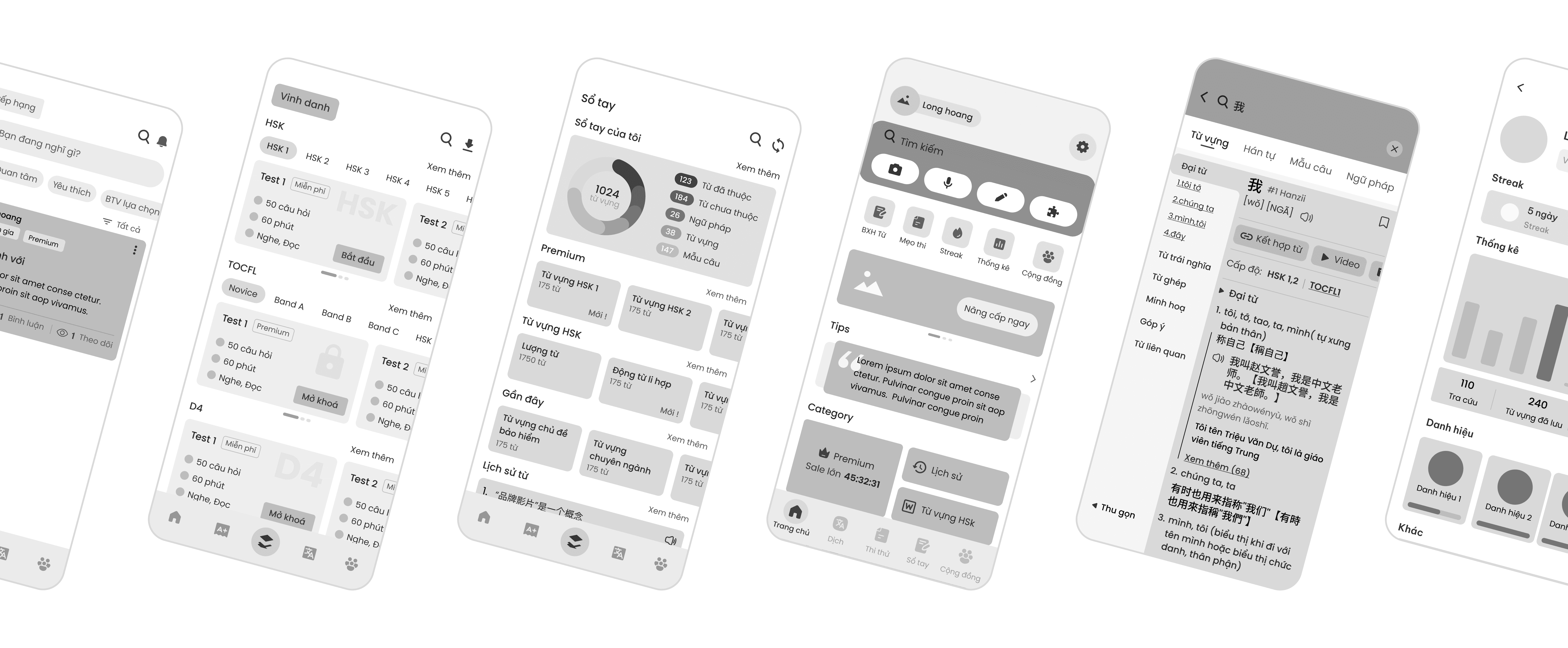
Architectural blueprints to restructure the interface & declutter key screens without visual distractions. These layouts will be tested with real users to validate the new information hierarchy before finalizing the design.
8/8
8/8
Successfully completed the core tasks
Successfully completed the core tasks
Successfully completed the core tasks
6/8
6/8
Appreciated the improved information hierarchy
Appreciated the improved information hierarchy
Appreciated the improved information hierarchy
7/8
7/8
Found the UI intuitive and easy to learn
Found the UI intuitive and easy to learn
Found the UI intuitive and easy to learn
Concept Development
Concept Development
Concept Development
We combined Flat Design, Minimalism and Glassmorphism. This balance keeps the dense dictionary interface clean & lightweight, ensuring a modern, distraction-free experience that stays focused on core content.

Flat design
Optimize performance

Minimalism
Declutter text-heavy layouts

Glassmorphism
Accent to define depth and hierarchy
Foundation
A clear set of core elements: colors, typography, icons, grids & elevations.
Color
Color
We refreshed our brand identity with a blue palette to create a calmer, more focused learning space. This is supported by a neutral scale for visual depth and a semantic system to provide clear, consistent feedback.
We refreshed our brand identity with a blue palette to create a calmer, more focused learning space. This is supported by a neutral scale for visual depth and a semantic system to provide clear, consistent feedback.
Brand
Brand
Brand
#212E4A
#212E4A
brand-0
brand-0
#252B37
#252B37
brand-5
brand-5
#2C416D
#2C416D
brand-10
brand-10
#42578B
#42578B
brand-20
brand-20
#4A69AB
#4A69AB
brand-30
brand-30
#527BBE
#527BBE
brand-40
brand-40
#6593CC
#6593CC
brand-50
brand-50
#82AFD8
#82AFD8
brand-60
brand-60
#AACAE6
#AACAE6
brand-70
brand-70
#CDDFF0
#CDDFF0
brand-80
brand-80
#E3ECF6
#E3ECF6
brand-90
brand-90
#F0F1F5
#F0F1F5
brand-100
brand-100
Neutral
Neutral
Neutral
#000000
#000000
neutral-0
neutral-0
#0F0F0F
#0F0F0F
neutral-10
neutral-10
#141414
#141414
neutral-15
neutral-15
#1A1A1A
#1A1A1A
neutral-20
neutral-20
#262626
#262626
neutral-25
neutral-25
#333333
#333333
neutral-30
neutral-30
#434343
#434343
neutral-35
neutral-35
#4F4F4F
#4F4F4F
neutral-40
neutral-40
#595959
#595959
neutral-45
neutral-45
#6E6E6E
#6E6E6E
neutral-50
neutral-50
#7D7D7D
#7D7D7D
neutral-55
neutral-55
#8C8C8C
#8C8C8C
neutral-60
neutral-60
#999999
#999999
neutral-65
neutral-65
#A6A6A6
#A6A6A6
neutral-70
neutral-70
#B3B3B3
#B3B3B3
neutral-75
neutral-75
#333333
#333333
neutral-80
neutral-80
#D6D6D6
#D6D6D6
neutral-85
neutral-85
#E5E5E5
#E5E5E5
neutral-90
neutral-90
#F2F2F2
#F2F2F2
neutral-95
neutral-95
#6E6E6E
#6E6E6E
neutral-100
neutral-100
Tone of Voice
Tone of Voice
Tone of Voice
Hanzii isn't a typical boring dictionary app. We’ve turned our mascot into a sassy scholar—inspired by Jin Xing, the iconic Chinese host known for her brutal honesty & biting sarcasm.


Savage support
Build a love-hate bond
Build a love-hate bond
Polite
Polite
Playful
Robotic
Relatable
Distant
Punchy & colloquial
Attack users’ ego or laziness
Attack users’ ego or laziness
Concise
Wordy
Slangy
Stiff
Casual
Formal
Pain point trigger
Keep it short & sharp
Keep it short & sharp
Urgent
Passive
Provocative
Vague
Direct
Academic
Key Improvements
Key Improvements
Key Improvements
A side-by-side evolution of the interface, highlighting strategic refinements that eliminate friction & add meaningful value to user experience.
Home
Refined the Home screen layout with a focus on hierarchy & visual separation. By creating distinct sections, we aim at reducing cognitive load & prioritized the search function as the primary action.
Refined the Home screen layout with a focus on hierarchy & visual separation. By creating distinct sections, we aim at reducing cognitive load & prioritized the search function as the primary action.
Before
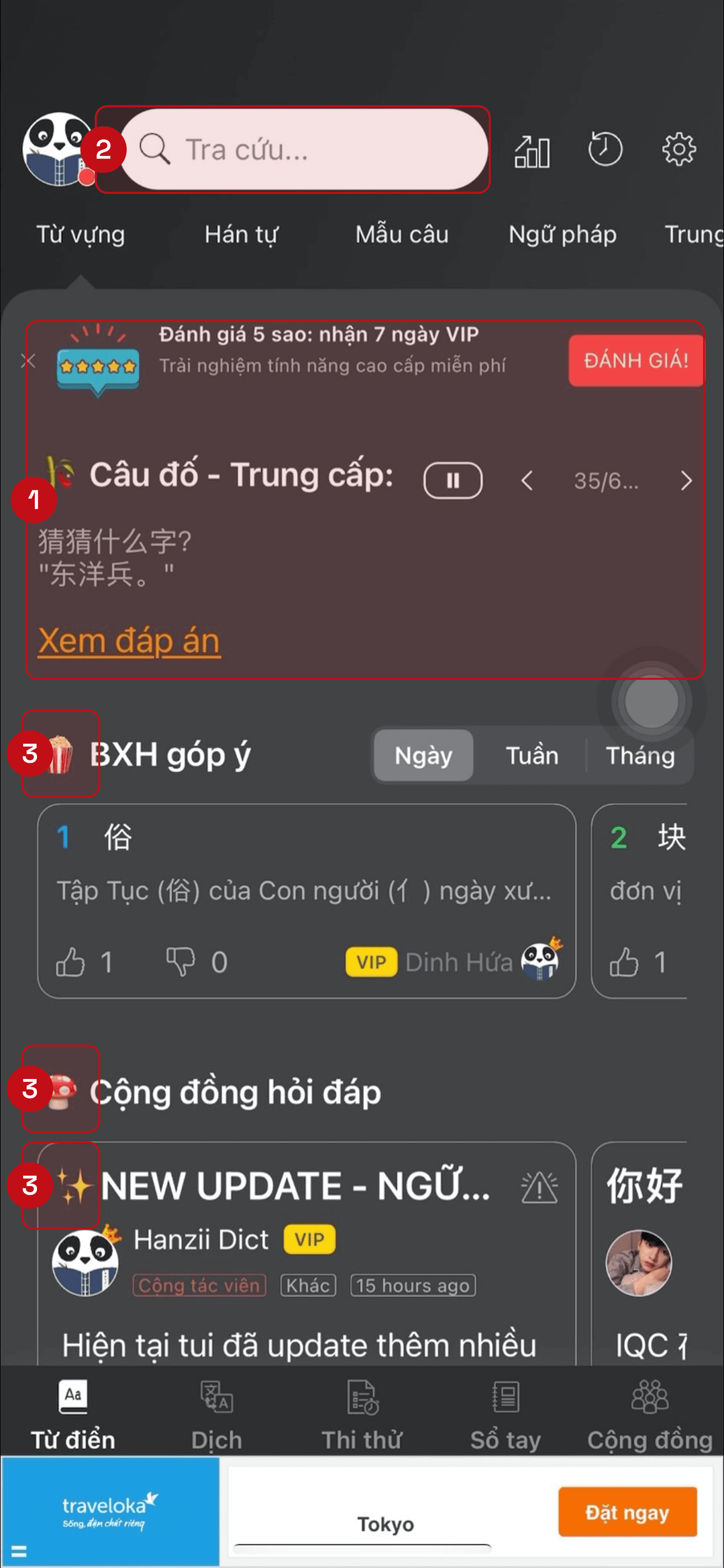
1. Fragmented layout
1. Fragmented layout
More cognitive load needed to decide where to start
More cognitive load needed to decide where to start
2. Low affordance for search
2. Low affordance for search
The most important feature was too small & lacked focus
The most important feature was too small & lacked focus
3. Unnecessary elements
3. Unnecessary elements
Confusing icons made the home screen harder to understand
Confusing icons made the home screen harder to understand
After
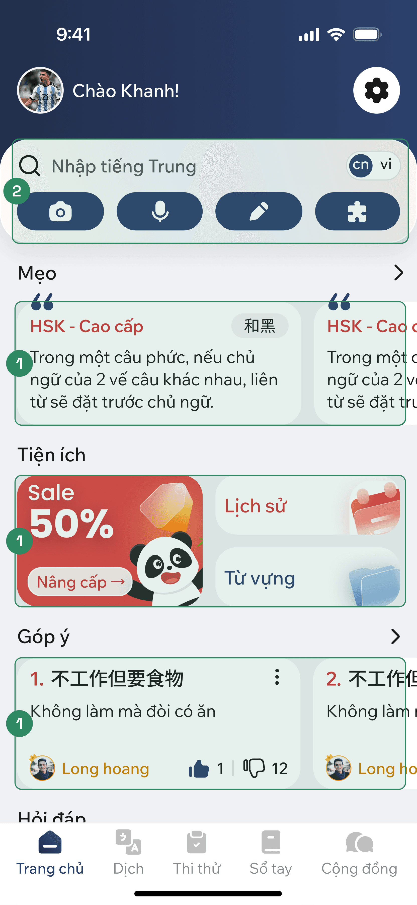
1. Defined sectioning
1. Defined sectioning
Distinct visual boundaries to enhances scanability
Distinct visual boundaries to enhances scanability
2. Prominent search bar
2. Prominent search bar
A focal point that catches the user's eye immediately
A focal point that catches the user's eye immediately
3. Minimal interface
3. Minimal interface
Removed all unnecessary icons and tabs for a cleaner look
Removed all unnecessary icons and tabs for a cleaner look
Dictionary
Transformed a cluttered data feed into a focused, learner-friendly interface that helps users find & process information effortlessly.
Transformed a cluttered data feed into a focused, learner-friendly interface that helps users find & process information effortlessly.
Before
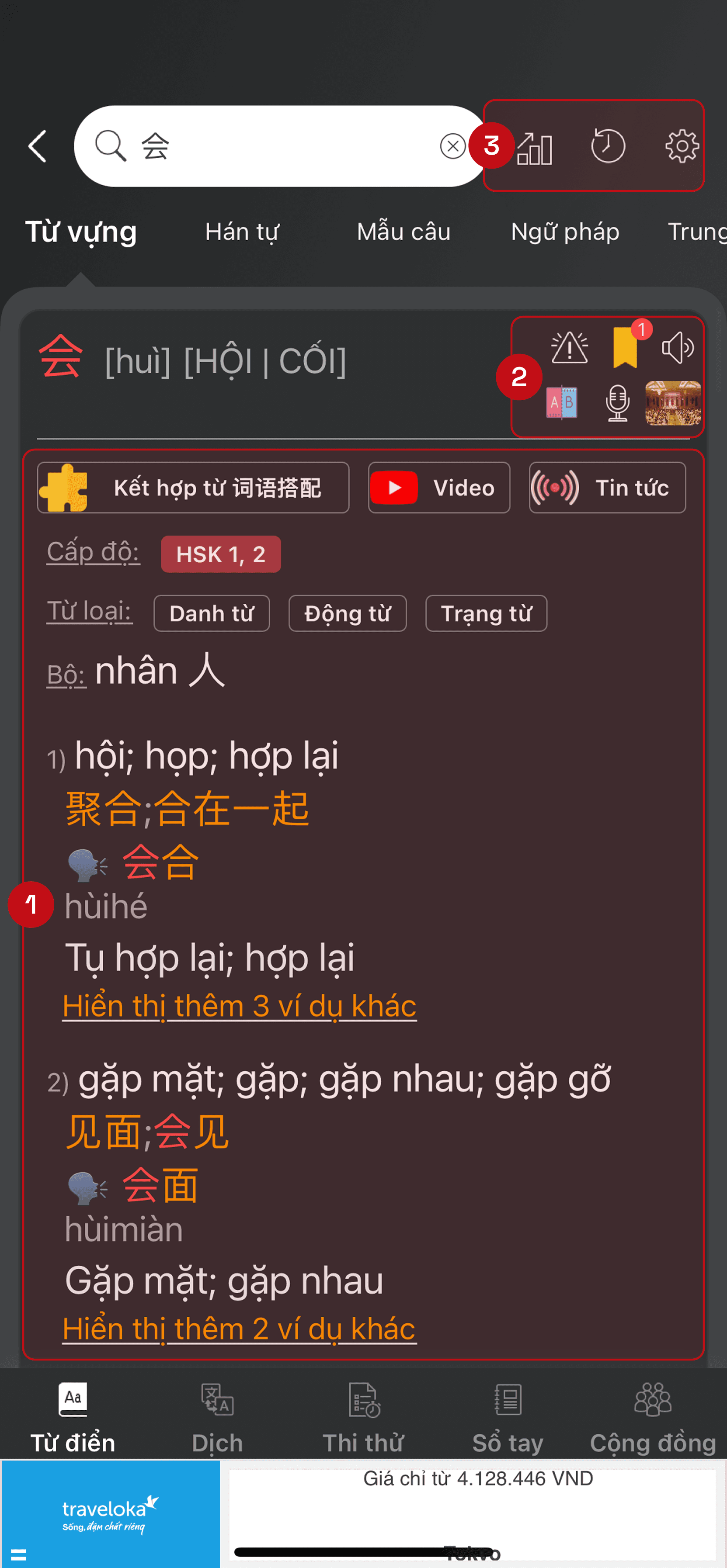
1. Overwhelming result
1. Overwhelming result
Present all information in a single, long scrollable feed
Present all information in a single, long scrollable feed
2. Cluttered elements
2. Cluttered elements
Interactive icons placed too closely, increase risk of mis-taps
Interactive icons placed too closely, increase risk of mis-taps
3. Distracting features
3. Distracting features
Leaderboard, history, and settings were unnecessary here
Leaderboard, history, and settings were unnecessary here
After

1. Collapsible navigation
1. Collapsible navigation
Instantly jump to specific sections for complete control
Instantly jump to specific sections for complete control
2. Spacing & visual harmony
2. Spacing & visual harmony
Reorganize icons with proper spacing & a consistent style
Reorganize icons with proper spacing & a consistent style
3. Distracting features
3. Distracting features
Remove non-essential icons for user to focus on search result
Remove non-essential icons for user to focus on search result
Translate
Optimized for better accuracy & readability, this redesign delivers smarter AI translation while distinguishing key tools through a clean, modern UI.
Optimized for better accuracy & readability, this redesign delivers smarter AI translation while distinguishing key tools through a clean, modern UI.
Before

1. Robotic translate result
1. Robotic translate result
Struggled with long sentences, failed to capture the context
Struggled with long sentences, failed to capture the context
2. Visual Overload
2. Visual Overload
Heavy use of solid blue created visual fatigue
Heavy use of solid blue created visual fatigue
3. Poor functional distinction
3. Poor functional distinction
Translate result & grammar check were styled the same
Translate result & grammar check were styled the same
After
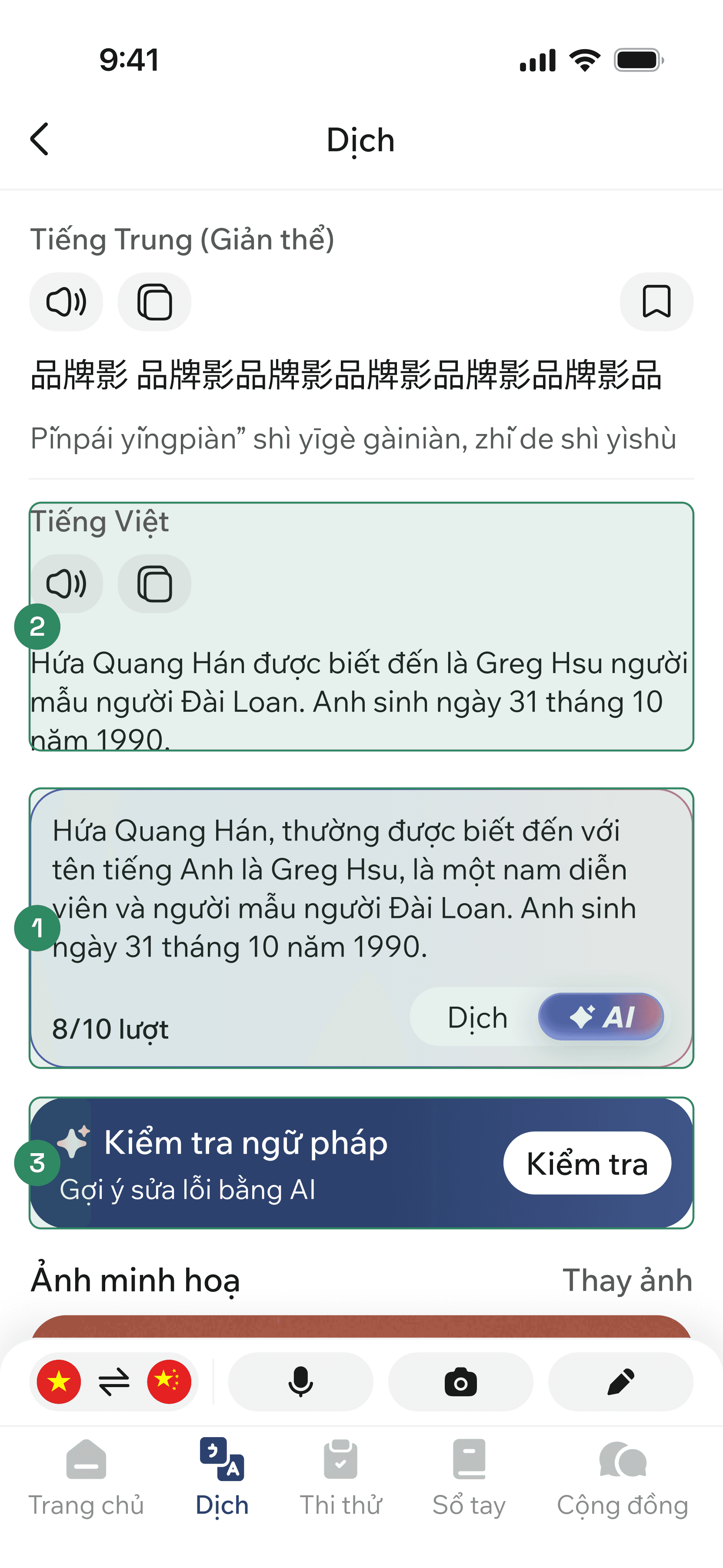
1. Intelligent AI translation
1. Intelligent AI translation
Delivers more accurate & natural-sounding results
Delivers more accurate & natural-sounding results
2. Clean Palette
2. Clean Palette
Simplify the color scheme by removing heavy background fill
Simplify the color scheme by removing heavy background fill
3. Unique styling for each
3. Unique styling for each
Apply different layout and color for clear distinction
Apply different layout and color for clear distinction
Notebook
Introduce customizable layouts and ensuring key features are easily accessible, creating a focused & clutter-free study environment for learners.
Introduce customizable layouts and ensuring key features are easily accessible, creating a focused & clutter-free study environment for learners.
Before
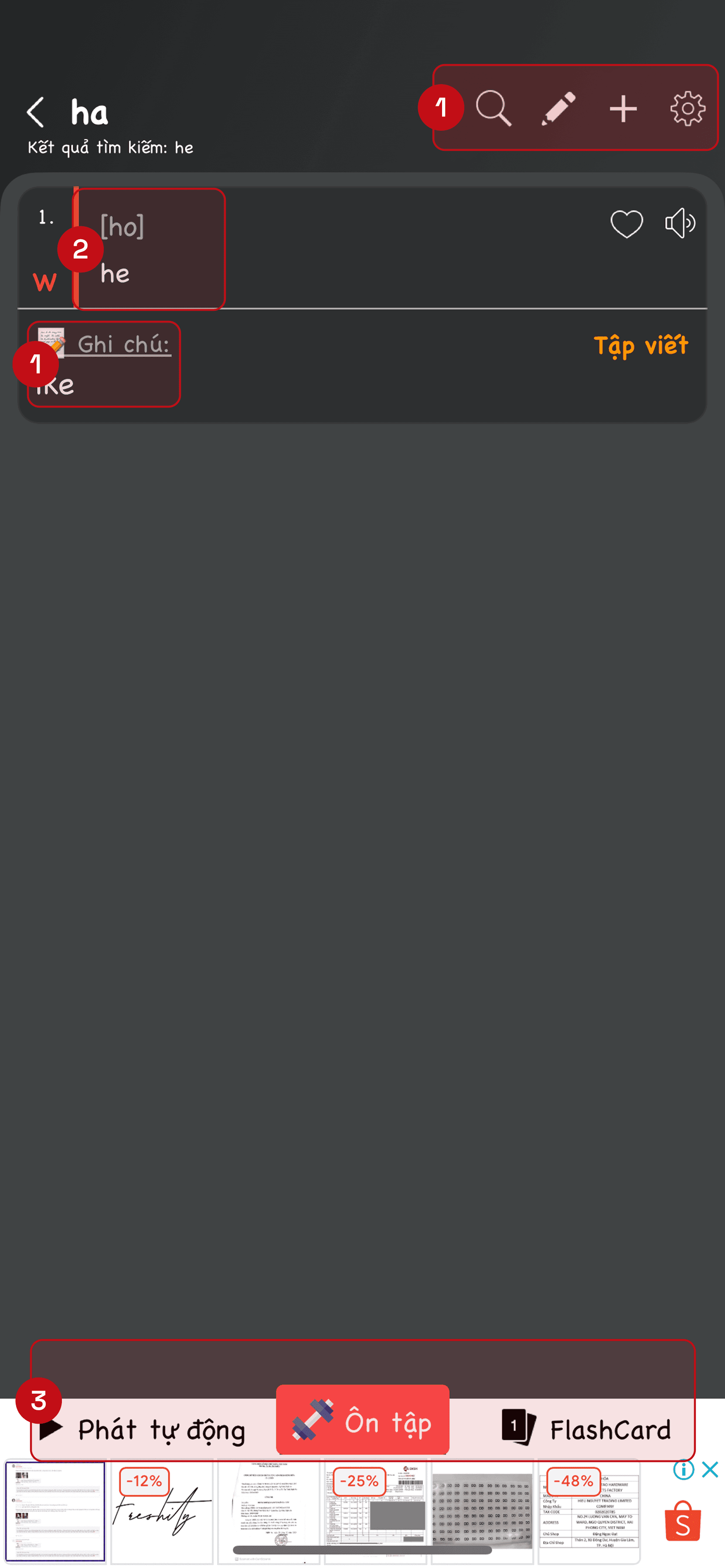
1. Inconsistent icons
1. Inconsistent icons
Lacked a unified style, making the interface look unpolished
Lacked a unified style, making the interface look unpolished
2. Limited study view
2. Limited study view
Without images, users struggled with vocabulary retention
Without images, users struggled with vocabulary retention
3. Hidden key features
3. Hidden key features
Key tools were hidden at the bottom and obscured by ads
Key tools were hidden at the bottom and obscured by ads
After
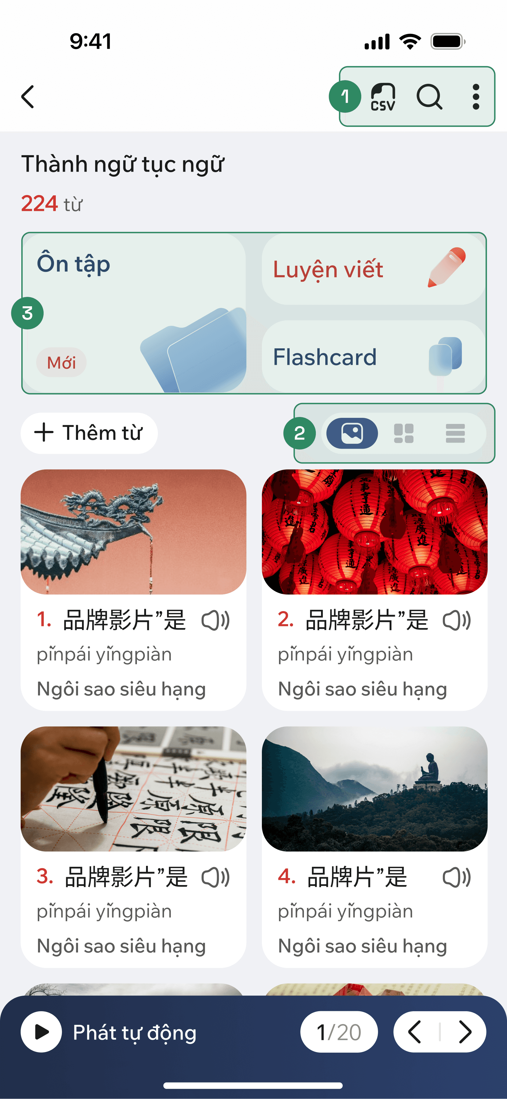
1. Unified style
1. Unified style
Standardize the icon set to ensure visual harmony
Standardize the icon set to ensure visual harmony
2. Versatile learning modes
2. Versatile learning modes
Grid, card, & list view for different learning styles
Grid, card, & list view for different learning styles
3. Style & position change
3. Style & position change
Move main features to the center, create a visual focus
Move main features to the center, create a visual focus
A few other screens
A showcase of additional key screens to provide a deeper understanding of the overall visual style.
A showcase of additional key screens to provide a deeper understanding of the overall visual style.


Design System
Design System
Design System
We focused on crafting the UI first to quickly test & lock in the visual concept with stakeholders. Once the style was finalized, we organized everything into a structured system using Atomic Design principles to ensure consistency.
Design tokens
Design tokens
To ensure consistency & scalability, we built our design system on a structured 3-layer token hierarchy.
To ensure consistency & scalability, we built our design system on a structured 3-layer token hierarchy.

Color
Mapped based on functional purposes

Number
Govern spacing, corner radius, size, ...

Typography
Defined tokens for different text roles

A glance at how we structure and organize our tokens
A glance at how we structure and organize our tokens
Components
Components
We follow atomic design to structure our UI library. By breaking the interface into atoms, molecules, organisms & templates, we create a modular system that is highly reusable & scalable.
Elements organizing
Elements organizing
Each UI element is meticulously managed on its own page. Related pages are grouped into functional folders: atoms, molecules, organisms, templates.
Each UI element is meticulously managed on its own page. Related pages are grouped into functional folders: atoms, molecules, organisms, templates.

UI elements management

Components properties
Base (30+ UI elements)
Base (30+ UI elements)
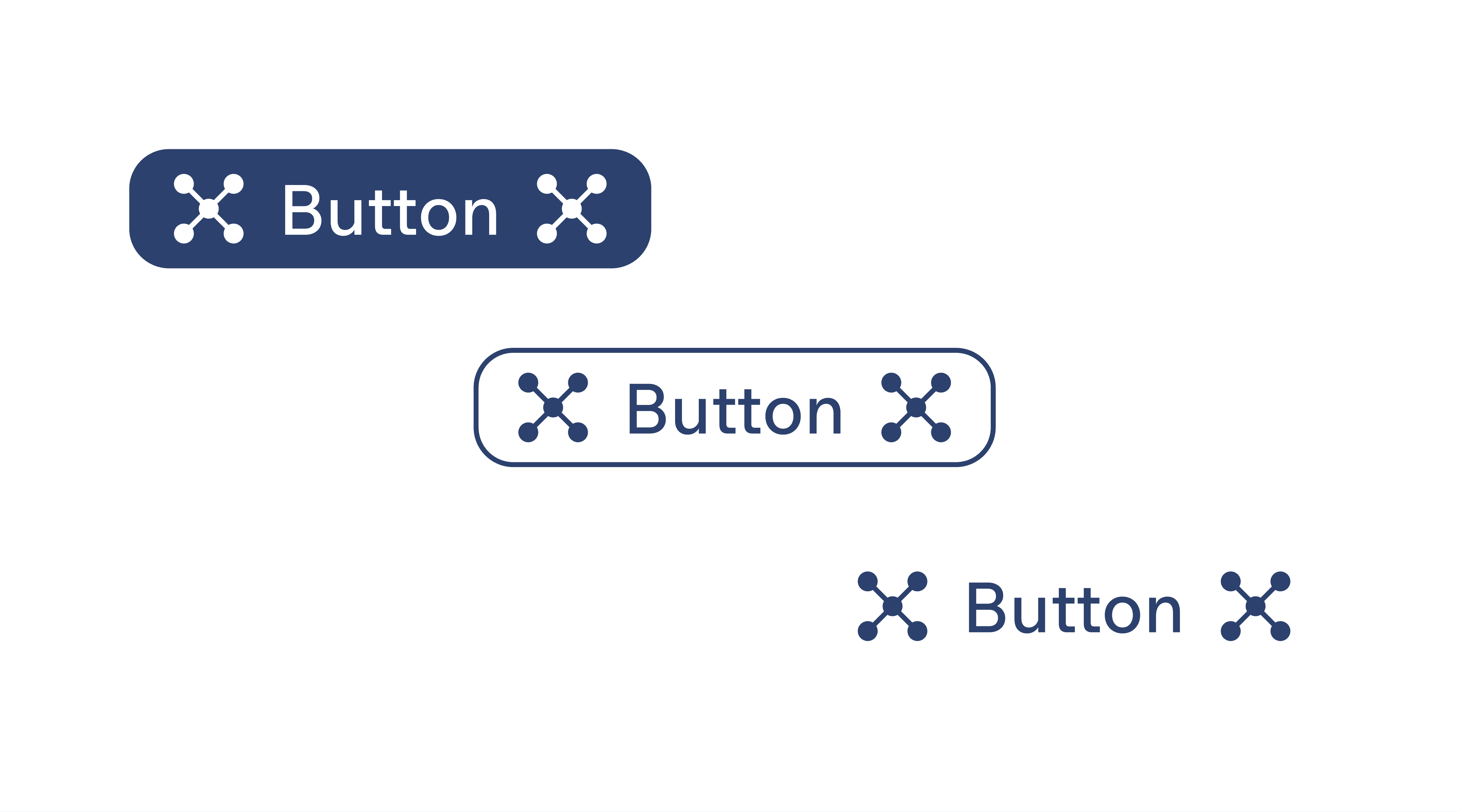
Buttons
Used across the app for key triggers

Icon buttons
Ideal for space-constrained areas

Images
Placeholders for dynamic content
Feature components
Feature components
Stepper
Guide users through sequential tasks

Audio footer
Quick access to playback controls

Card translate
Core interactive element for translation
Final Impact
Final Impact
Final Impact
A data-driven look at how the redesign improved user experience through key UX metrics & user feedback.
Product metrics
Product metrics
+28%
Total revenue growth showed the immediate business impact of the redesign version
Total revenue growth showed the immediate business impact of the redesign version
+25.7%
Purchase volume suggests the simplified design facilitated purchasing decisions
Purchase volume suggests the simplified design facilitated purchasing decisions
+25%
Conversion rate increase
aligns with our initial goal for the redesign
Conversion rate increase
aligns with our initial goal for the redesign
+14.9%
DAU/WAU indicates that the app has sustained user interest over time
DAU/WAU indicates that the app has sustained user interest over time
-40%
Development time via the design system, enabling a faster time-to-market
Development time via the design system, enabling a faster time-to-market
-4.7%
D1 Retention reflects a temporary trade-off during the redesign launch
D1 Retention reflects a temporary trade-off during the redesign launch
User feedback
User feedback
The new look is actually pretty nice. It’s way easier to read and distinguish between sections now.
The new look is actually pretty nice. It’s way easier to read and distinguish between sections now.
The AI translation is actually pretty spot on. It captures the context way better than before.
The AI translation is actually pretty spot on. It captures the context way better than before.
Positive
Positive
Positive
Everything feels so new and confusing! I will need more time to get used to it
Everything feels so new and confusing! I will need more time to get used to it
The translation speed is kinda slow. Hope you guys can fix that soon!
The translation speed is kinda slow. Hope you guys can fix that soon!
Negative
Negative
Negative
Key Takeaways
Key Takeaways
Key Takeaways
The redesign initially faced hurdles with user adaptation & scope management. We learned to balance bold visual changes with familiar habits through phased launches & smarter communication.
Challenges
Challenges
Challenges
User control & freedom: The change was sudden, which left some users confused & wanting the old version back.
User control & freedom: The change was sudden, which left some users confused & wanting the old version back.
Ego overcome: We struggled to balance fresh looks with how users were used to doing things. In the end, we decided to give up some cool designs to ensure the app stayed intuitive & matched our users' mental model.
Ego overcome: We struggled to balance fresh looks with how users were used to doing things. In the end, we decided to give up some cool designs to ensure the app stayed intuitive & matched our users' mental model.
Feature creep: The product team wanted to pack multiple new features into the redesign, which risked overcomplicating the user experience.
Feature creep: The product team wanted to pack multiple new features into the redesign, which risked overcomplicating the user experience.
Lesson learned
Lesson learned
Lesson learned
Stay calm with feedback: Don't panic over a few complaints. Look at the data—if a feature benefits the majority & supports business goals, it’s often worth keeping.
Stay calm with feedback: Don't panic over a few complaints. Look at the data—if a feature benefits the majority & supports business goals, it’s often worth keeping.
Usability & aesthetic: Always prioritize a design that is easy to understand and use, not the cool or flashy one.
Usability & aesthetic: Always prioritize a design that is easy to understand and use, not the cool or flashy one.
Launch in phases: Break big projects into smaller steps. Focus on high-impact features first. This saves resources & lets us to test user reactions.
Launch in phases: Break big projects into smaller steps. Focus on high-impact features first. This saves resources & lets us to test user reactions.
Further Improvements
Further Improvements
Further Improvements
Personalized Learning
Personalized Learning
Personalized Learning
Shifting from a one-size-fits-all model to a personalized experience that tracks individual progress & provides tailored study support.
Shifting from a one-size-fits-all model to a personalized experience that tracks individual progress & provides tailored study support.
AI-Powered Tools
AI-Powered Tools
AI-Powered Tools
Exploring advanced AI to refine core features, such as smart pronunciation scoring, tiny lessons and AI Chat.
Exploring advanced AI to refine core features, such as smart pronunciation scoring, tiny lessons and AI Chat.
Thank you for
watching!
Thank you for
watching!
Thank you for
watching!


Interested in working with me?
Interested in working with me?
Interested in working with me?
Other Projects
Other Projects
Other Projects
Curious to see more? Check out these case studies
Curious to see more? Check out these case studies

Website
5 mins read
Todaii Japanese: Enhancing web platform contribution
0%
0%
Revenue contribution
Website
5 mins read
Todaii Japanese: Enhancing web platform contribution
0%
0%
Revenue contribution
Website
5 mins read
Todaii Japanese: Enhancing web platform contribution
0%
0%
Revenue contribution
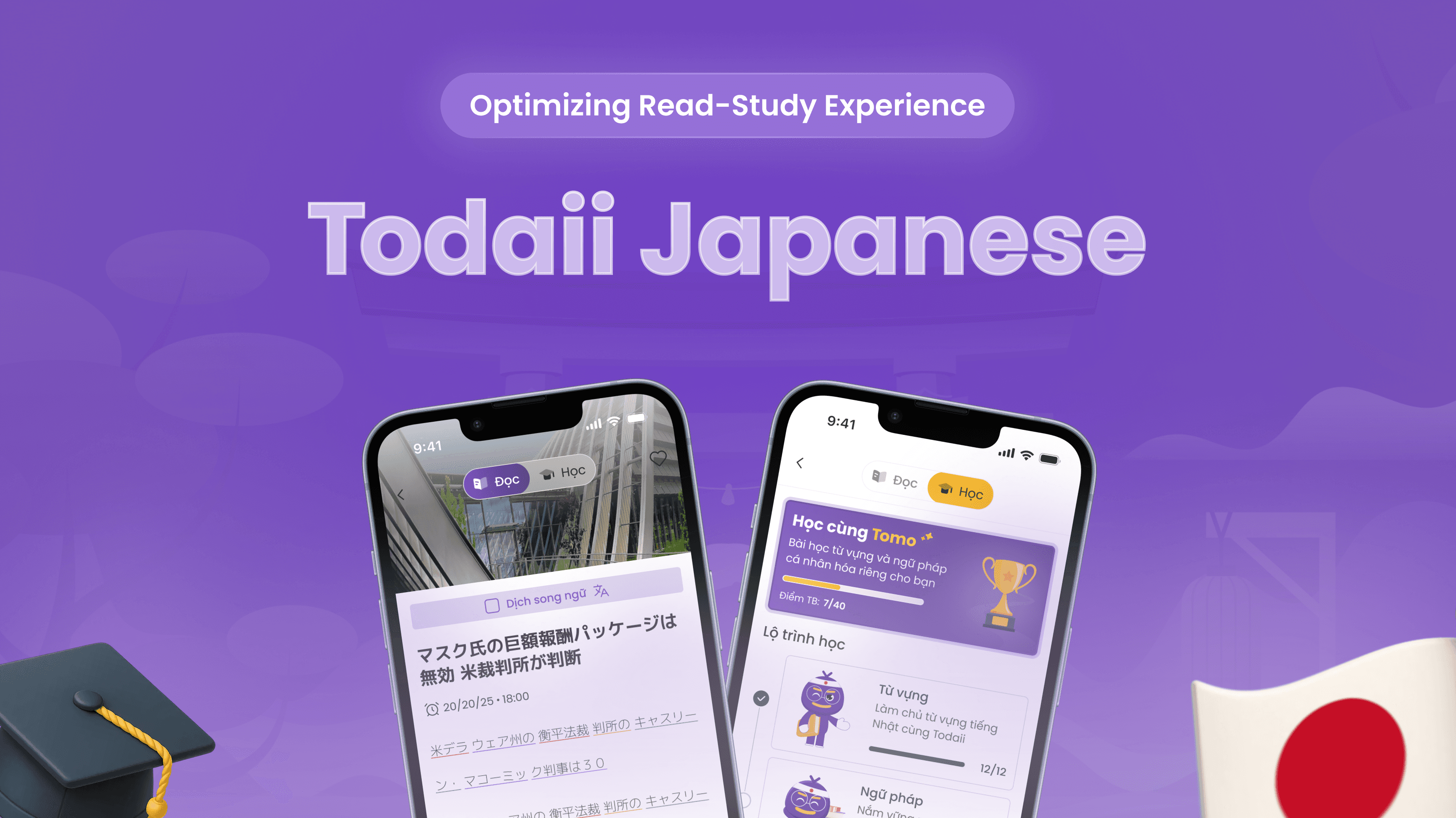
Mobile App
6 mins read
Todaii Japanese: Boosting user stickiness via integrated learning
0%
0%
DAU/MAU
Mobile App
6 mins read
Todaii Japanese: Boosting user stickiness via integrated learning
0%
0%
DAU/MAU
Mobile App
6 mins read
Todaii Japanese: Boosting user stickiness via integrated learning
0%
0%
DAU/MAU