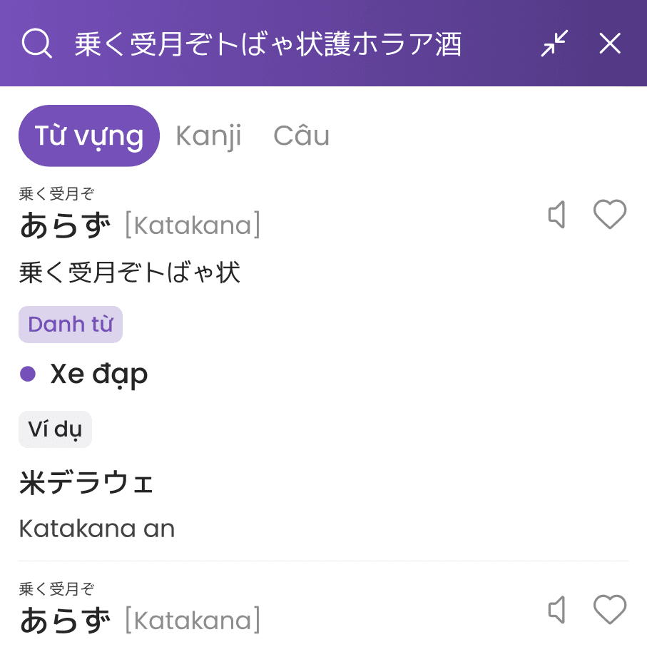
Todaii Japanese: Enhancing web platform contribution

Descriptions

  • Part of the Todaii product ecosystem, focusing on mastering Japanese through daily news.

  • Diverse range of features: Daily news, JLPT tests, dictionary, video & podcast.

Problems

  • No design update for 9 years. The UI is clunky, cluttered & feels like it’s stuck in the past.

  • While the app evolved, the web was neglected, making the jump between devices feel messy.

  • Contributing only 10% of revenue, the Web needs investment to reach 2026 revenue goal.

Current Context

Current Context

Current Context

+77.6%

Revenue grew 1.6x faster than the app, showing a rising demand from desktop users.

x3.0

First visit CR reflects better user quality & a higher potential for conversion.

x2.0

Retention D1 in 6 months, proving our web content is valuable despite the old UI.

However...

~3.7%

Contribution to Todaii Japanese’s total revenue, reflecting platform imbalance

0.37%

Low purchase CR indicates a massive gap compared to the app version or Todaii Japanese

5m 55s

Avg. Engagement time/AU is 6x lower than the app, limiting the potential for deep-learning

Despite clear growth signals, Todaii Japanese Web is being under-utilized & requires more focus to maximize its potential & boost its overall contribution to Todaii ecosystem

Despite clear growth signals, Todaii Japanese Web is being under-utilized & requires more focus to maximize its potential & boost its overall contribution to Todaii ecosystem

Despite clear growth signals, Todaii Japanese Web is being under-utilized & requires more focus to maximize its potential & boost its overall contribution to Todaii ecosystem

Stakeholder Interview

Stakeholder Interview

Stakeholder Interview

To ensure the design strategy aligns with business objectives, I conducted a stakeholder interview using SPHP framework. This allowed me to gather critical insights & bridge the gap between user needs & business constraints.

Success Metrics

  • What are the primary KPIs we need to impact

  • Traffic grow to 100K monthly visits (from 18K)

  • Increase session duration to 10 minutes

  • Revenue increase by 50%

  • Traffic grow to 100K monthly visits (from 18K)

  • Increase session duration to 10 minutes

  • Revenue increase by 50%

Priorities

  • What are the key features and biggest business challenges to solve?

  • Sync data & features from the app to web to ensure a seamless cross-platform experience.

  • Optimizing UX at a basic level before

  • Enhance the reading experience

  • Sync data & features from the app to web to ensure a seamless cross-platform experience.

  • Optimizing UX at a basic level before

  • Enhance the reading experience

History & expertise

  • Who are our key competitors, and what UX patterns should we learn from?

  • Modeling success from NHK & Mazii for better user retention.

  • Referencing Tofugu for its modern, highly readable UI & high-quality content.

  • Modeling success from NHK & Mazii for better user retention.

  • Referencing Tofugu for its modern, highly readable UI & high-quality content.

Process & workflow

  • What are the constraints or legacy issues we must address?

  • Strategically managing limited resources as the Mobile App remains the primary focus.

  • A lack of both qualitative & quantitative user research data for web.

  • Strategically managing limited resources as the Mobile App remains the primary focus.

  • A lack of both qualitative & quantitative user research data for web.

Objective & Approach

Objective & Approach

Objective & Approach

1. Primary goal

  • Boost web revenue & conversion rates to support the Todaii ecosystem's expansion.

  • Increase user stickiness & long-term engagement on the web platform.

2. What to do

  • Identify UX friction points in the current web experience.

  • Propose targeted solutions to enhance user experience, hence driving higher conversion rate & revenue.

Design Process

Design Process

Design Process

With limited prior research on our Web users, Design Thinking provides a clear path to rebuild our foundation. It allows us to replace assumptions with actual user insights, ensuring that every update is driven by real needs.

🔍 Empathize

🔍 Empathize

🎯 Define

🎯 Define

🔨 Ideate

🔨 Ideate

🚀 Prototype

🚀 Prototype

🚀 Test

🚀 Test

My role

  • Directly handled the end-to-end design process from user research to high-fidelity UI design & testing.

  • Directly handled the end-to-end design process from user research to high-fidelity UI design & testing.

  • Collaborated across functions (PM, Marketing, CS, Dev, Tester) to gather insights & streamline the design workflow.

  • Collaborated across functions (PM, Marketing, CS, Dev, Tester) to gather insights & streamline the design workflow.

No time for lengthy process?

No time for lengthy process?

Secondary Research

Secondary Research

Secondary Research

Review mining

Analyzing user feedback from customer service logs & forums to identify critical pain points & expectations. Gathered data helps us prioritize high-impact Web improvements efficiently.

Need dark mode ASAP. Studying on this screen really hurts my eyes.

Why are my saved words on the app not showing up on web?

As a beginner, I’m totally lost and don't know where to start

Is this really the same Todaii Japanese app? The design is so outdated!

Competitor Audit

I categorized competitors into Direct, Indirect & Emerging groups to identify market gaps. This audit helps benchmark key features & modern design standards to elevate the Todaii Web experience.


Tofugu

  • High readability through a clean & minimalist design with generous white space.

  • No built-in learning tools (dictionary or grammar lookup)

JLPT.JP

  • The most trustworthy source for official exam information and materials.

  • Outdated, text-heavy design & poor navigation that overwhelm users

Jisho

  • Simple interface with many search methods (handwriting, radicals, ...)

  • Disconnected user flow & non-interactive UI elements can cause confusion.

Japanese Pod 101

  • Excellent lesson hierarchy & a smart content discovery system.

  • Fragmented UI design & repetitive exercises can lead to user boredom.

While most competitors focus deeply on a single core feature, Todaii offers an all-in-one platform but lacks the depth & seamless connection between its features

While most competitors focus deeply on a single core feature, Todaii offers an all-in-one platform but lacks the depth & seamless connection between its features

While most competitors focus deeply on a single core feature, Todaii offers an all-in-one platform but lacks the depth & seamless connection between its features

Primary Research

Primary Research

Primary Research

Design audit

Integrating heatmap testing & usability heuristics to audit the current experience. Finding are organized into a 4-tier system to effectively prioritize design solutions.

Several usability & interface issues

Weak interactive feedback

Weak interactive feedback

Inconsistent UI elements & lack of system feedback leave users uncertain if their actions worked

Poor information hierarchy

Poor information hierarchy

Key features lack visibility while secondary elements occupy excessive space & focus

Weak retention flow

Weak retention flow

Lack of connection between features to guide users through a seamless experience

High cognitive load

High cognitive load

Redundant data & non-essential information distract users from their primary goals

Usability Testing

To address the lack of previous web user research, I observed users performing core tasks & followed up with interviews. This revealed the root causes of their behaviors & underlying needs.

Messy & outdated UI. Fonts & images are all over the place

Messy & outdated UI. Fonts & images are all over the place

Up-to-date content, but the layout is too cramped to follow

Up-to-date content, but the layout is too cramped to follow

No Notebook on web? My saved words on app didn't sync

No Notebook on web? My saved words on app didn't sync

Lots of features, but they don't connect & guide me properly

Lots of features, but they don't connect & guide me properly

Finding content is a pain without a search bar or filters

Finding content is a pain without a search bar or filters

The Furigana toggle is harder to find here than on mobile

The Furigana toggle is harder to find here than on mobile

5/6

Users found the UI cluttered & packed with unnecessary info

6/6

Users complained about poor sync between app & web, especially the missing notebook

Come up with Solutions

Come up with Solutions

Come up with Solutions

By transforming previous research insights into How Might We (HMW) questions, we brainstormed & identified three core pillars for improvement.

As is: Cramped UI with excessive noise that distracts users

As is: Cramped UI with excessive noise that distracts users

To be: Declutter the interface to help users focus on their main tasks

To be: Declutter the interface to help users focus on their main tasks

As is: Missing features & broken data sync between App & Web

As is: Missing features & broken data sync between App & Web

To be: Sync core features & user data for a seamless experience

To be: Sync core features & user data for a seamless experience

As is: Outdated design with inconsistent styles & unclear interaction states

As is: Outdated design with inconsistent styles & unclear interaction states

To be: Define a new concept & build a unified Design System

To be: Define a new concept & build a unified Design System

Mid-fi Wireframe

Mid-fi Wireframe

Mid-fi Wireframe

Since usability tests confirmed the current flow works, I focused on optimizing information hierarchy & app-to-web feature integration. This refines the UI without forcing users to relearn, while ensuring technical feasibility.

Concept Development

Concept Development

Concept Development

I translated Todaii’s brand personality into a visual language using Aaker’s 5 Dimensions. This resulted in a blend of Minimalism, Material & Corporate design for a consistent web experience.

Minimalism

Simplifies text-heavy news layouts for better readability

Corporate design

Establishes a professional, trustworthy vibe for an educational platform
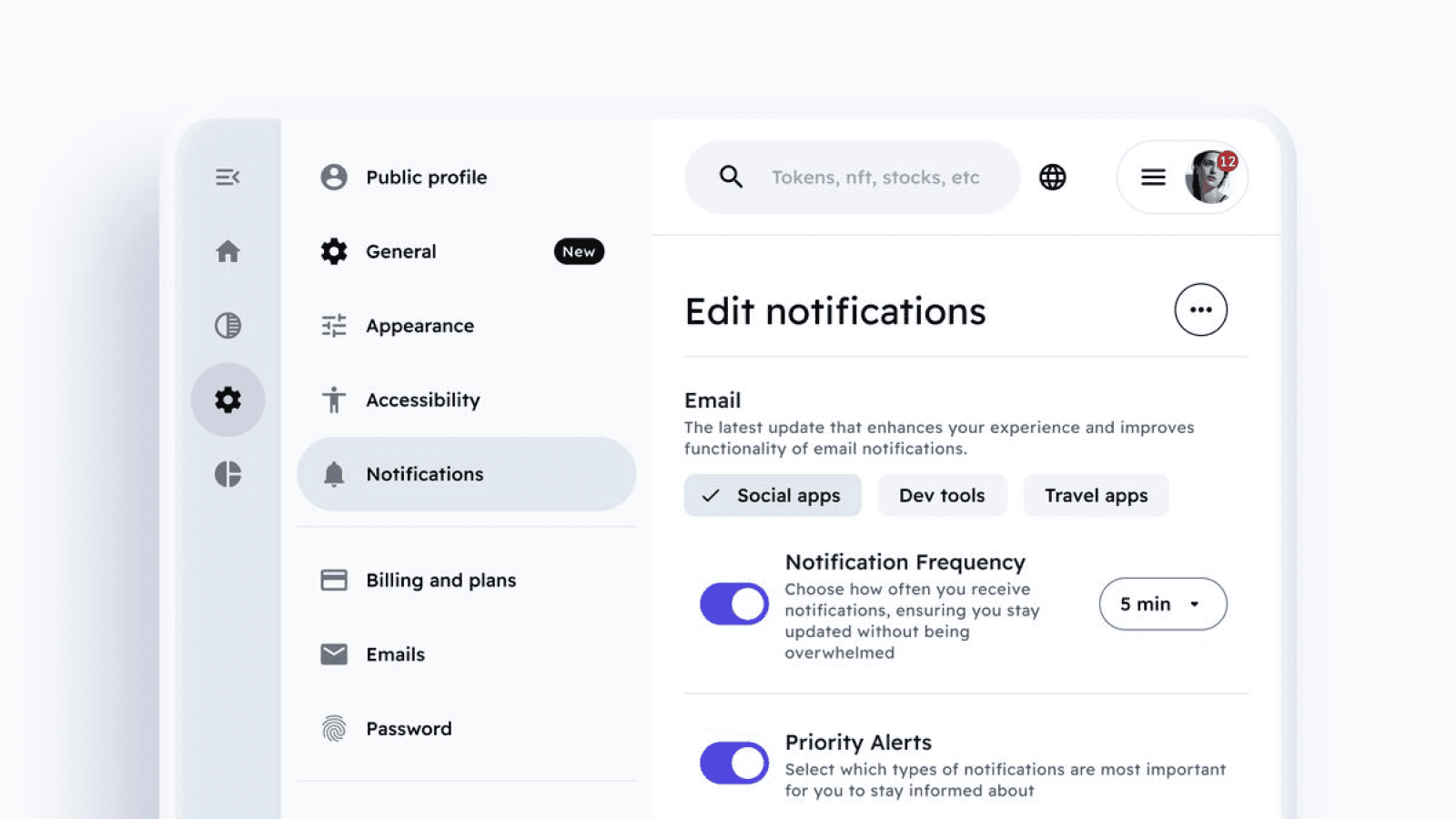
Material

Uses hierarchy & elevation to highlight key actions

Design System

Design System

Design System

A scalable foundation built to ensure consistency & efficient handoff before moving into high-fidelity design.

Foundation

A set of core elements (colors, typography, icons, grids, & elevations) that serve as the project's building blocks. These are aligned with the app version to ensure a consistent experience across all devices.

Color
Color

The primary purple blends red’s energy with blue’s stability, symbolizing creativity & strength. It is paired with a high-contrast orange-yellow accent to ensure visual hierarchy & accessibility.

The primary purple blends red’s energy with blue’s stability, symbolizing creativity & strength. It is paired with a high-contrast orange-yellow accent to ensure visual hierarchy & accessibility.

Primary

Primary

Primary

#1D142E

#1D142E

primary-0

primary-0

#2F204A

#2F204A

primary-10

primary-10

#402C66

#402C66

primary-20

primary-20

#523882

#523882

primary-30

primary-30

#64449D

#64449D

primary-40

primary-40

#7550B9

#7550B9

primary-50

primary-50

#8A6AC3

#8A6AC3

primary-60

primary-60

#9E84CE

#9E84CE

primary-70

primary-70

#B39FD9

#B39FD9

primary-80

primary-80

C8B9E3

C8B9E3

primary-90

primary-90

#DCD3ED

#DCD3ED

primary-100

primary-100

Accent

Accent

Accent

#3F2B05

#3F2B05

accent-0

accent-0

#644508

#644508

accent-10

accent-10

#895F0B

#895F0B

accent-20

accent-20

#AF790E

#AF790E

accent-30

accent-30

#D59311

#D59311

accent-40

accent-40

#FAAD14

#FAAD14

accent-50

accent-50

#6593CC

#6593CC

accent-60

accent-60

#FBC55A

#FBC55A

accent-70

accent-70

#FCD27E

#FCD27E

accent-80

accent-80

#FDDEA1

#FDDEA1

accent-90

accent-90

#FEF1D7

#FEF1D7

accent-100

accent-100

Design tokens

Design tokens

I structured color, number & typography tokens into a three-tier system: value, global & alias. This ensures a scalable & organized workflow, linking raw values to specific functional uses for easy maintenance.

Color

Mapped to surface, content & border for system-wide consistency
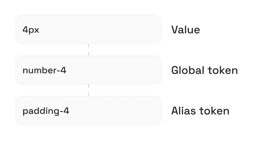
Number

Used for spacing, radius & sizing to maintain layout rhythm

Typography

Organized hierarchy linking font values to functional roles

A quick look at our token hierarchy & structure

A quick look at our token hierarchy & structure

Components

Components

I applied Atomic Design principles to build a modular library, organizing components into Atoms, Molecules, Organisms, and Templates. This ensures a scalable & consistent design system.

File organizing

File organizing

Each component has its own dedicated page. I used Figma properties to manage predefined states, ensuring both flexibility & system-wide consistency.

UI elements management

Components properties

Base (30+ UI elements)

Base (30+ UI elements)

Buttons

Used across the app for key triggers

Check boxes

Used for toggling specific options

Tabs

Navigate between content views
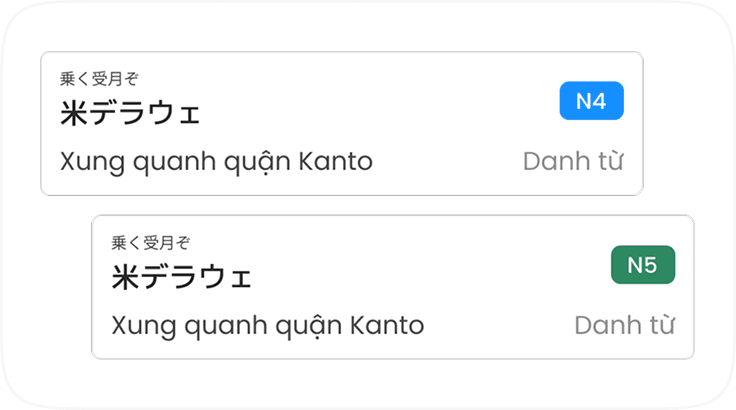
Feature components

Feature components

Card vocab

Displays vocab details & JLPT levels

Card notebook

Links to vocab list saved by users

AI button

Used for AI voice interaction

Key Improvements

Key Improvements

Key Improvements

Side-by-side comparison between the old & new design. This section highlights the existing friction points & the design solutions applied to enhance the overall user experience.

Home

The redesign replaces the cluttered layout with a clean sidebar to make navigation much smoother. The new layout removes clutter & tidies up the feed so users can browse & find articles effortlessly.

Before

1. Limited scalability

1. Limited scalability

The horizontal header lacks space to add more features from the mobile app version.

2. Weak upgrade CTA

2. Weak upgrade CTA

The upgrade button is subtle & lacks visual hierarchy, leading to low user engagement.

3. Inconsistent image sizes

3. Inconsistent image sizes

Random image sizes create a messy & broken layout, making the platform look unpolished.

4. Visual noise

4. Visual noise

Bulky banner & irrelevant info crowd the layout, competing with articles for attention.

After

1. Sidebar navigation

1. Sidebar navigation

Switching to a side navigation to accommodate new features & ensure a more modern look.

2. Enhanced visibility

2. Enhanced visibility

Moved the CTA to both the main header & the sidebar with a discount tag to attract users.

3. Standardized ratio

3. Standardized ratio

Applied a consistent 16:9 ratio to all thumbnails for a cleaner & more organized grid.

4. Space optimization

4. Space optimization

Resize the banner & remove redundant information to minimize cognitive load.

Old version

Old version

Old version

New version

New version

New version

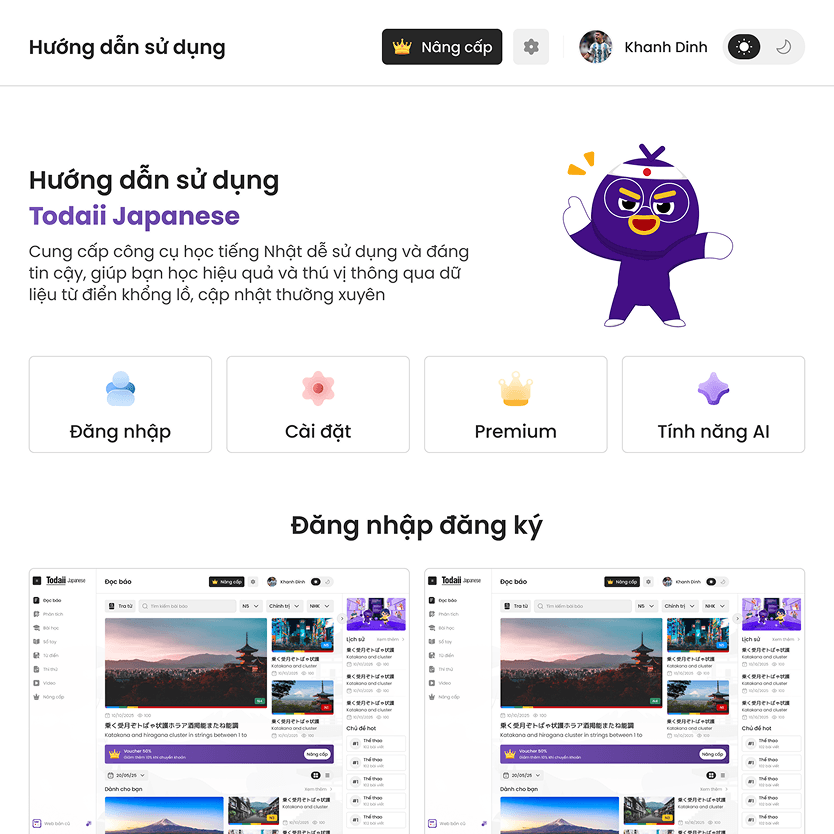
Gradual Adaptation: Bridging Mental Model

To avoid mental model shock, I provided a shortcut to switch between the old & new versions. I also designed a tutorial page to help users easily adapt to the new interface & features.
News detail

The redesign removes distractions to create a focused reading experience. With a cleaner layout & sticky controls, the new UI allows users to engage with articles effortlessly while keeping essential tools within reach.

Before

1. Cramped reading space

1. Cramped reading space

Suggested articles on the right creates visual noise, distracting users from their primary goal of reading.

2. Inconvenient furigana toggle

2. Inconvenient furigana toggle

The toggle is hidden at the top, forcing users to scroll all the way back up to switch it on or off.

3. Hidden translation button

3. Hidden translation button

The translation toggle is too subtle & easily overlooked, failing to catch users’ attention.

4. Overwhelming content length

4. Overwhelming content length

Long, dense articles can overwhelm users, making them feel lost while scrolling.

After

1. Centered focus mode

1. Centered focus mode

Moved related news to the bottom & allowed hiding both sidebars for 100% reading focus.

2. Sticky control bar

2. Sticky control bar

Sticky toggle allows users to toggle Furigana at any point during their reading process.

3. Prominent button

3. Prominent button

Increased size & color prominence, adding a checkbox to help users clearly visualize the on/off state.

4. Reading progress bar

4. Reading progress bar

Added a progress bar to help users track their position & stay in control of the content length.

User control: Collapsible lookup window

Usability testing revealed that the lookup popup overlaps the article, interrupting the reading flow. I added a minimized state to let users tuck the tool away while preserving their results, reducing interaction cost.

Usability testing revealed that the lookup popup overlaps the article, interrupting the reading flow. I added a minimized state to let users tuck the tool away while preserving their results, reducing interaction cost.

Usability Heuristic #3

Usability Heuristic #3

Usability Heuristic #3

Lesson

The redesign organizes the diverse library into a goal-oriented structure with integrated search & filters. The new layout eliminates clutter, helping users find lessons easily & stay motivated to continue.

Before

1. Over-prominence alphabet

1. Over-prominence alphabet

Basic alphabet tables take up the most important space at the top, even though they are rarely used.

2. Poor lesson discoverability

2. Poor lesson discoverability

The library is diverse, but users lack tools to quickly find the right lessons for their needs.

3. Information overload

3. Information overload

The lesson list is too long & unorganized, overwhelming users with too many options at once.

4. Lack of learning triggers

4. Lack of learning triggers

The design lacks visual triggers & clear prompts, failing to motivate users to start a lesson.

After

1. Secondary sidebar placement

1. Secondary sidebar placement

Moved to the right sidebar to keep the main area clear while remaining easy to find when needed.

2. Advanced search & filters

2. Advanced search & filters

Added a search bar & filters for topics, levels & progress to help users find suitable lessons faster.

3. Goal-oriented grouping

3. Goal-oriented grouping

Grouped lessons into clear categories to reduce cognitive load & help users choose easily.

4. Resume card & progress stats

4. Resume card & progress stats

Added study statistics & a shortcut to ongoing lessons, motivating users to stay on track.

Premium

The redesign simplifies the upgrade process by removing clutter & improving visual hierarchy. Using selective visual accents, the new UI creates a premium feel that guides users toward key plans.

Before

1. Irrelevant information

1. Irrelevant information

Secondary content on the right takes up key space without influencing users’ purchase decision.

2. Dull & uninspiring design

2. Dull & uninspiring design

The monotone design feels unprofessional, failing to generate excitement or encourage users to upgrade.

3. Missing AI package

3. Missing AI package

The previous version lacked an option to purchase AI features, leading to missed sales.

After

1. Conversion-focused

1. Conversion-focused

Removed redundant content to highlight high-value details that drive purchase decisions.

2. Visual accents

2. Visual accents

Add visual accents to key areas for a premium look that can motivates users to buy.

3. Integrated AI tab

3. Integrated AI tab

Added a tab for the AI package, allowing users to view & purchase AI package on the web.

Final Impact

Final Impact

Final Impact

A data-driven look at how the redesign improved user experience through key UX metrics & user feedback.

Product metrics

Product metrics

+48.9%

Total revenue growth showed the immediate business impact of new web version

Total revenue growth showed the immediate business impact of new web version

+40.8%

Payment CR suggests the new web experience facilitate purchasing decision

+65.7%

DAU/WAU indicates that the new UI kept users more interested & active over time

+50.7%

Revenue contribution reflects the enhanced product value after the full redesign

+16.7%

D1 Retention reflects a positive first impression of the new website for new users

+4.27%

Monthly ARPU aligns with the goal of improving value for every paying user

User feedback

Most users love the cleaner interface, which helps them focus better on content. While most appreciate the improved clarity, some users reported occasional lag, particularly with the lookup feature.

It's easy to use and find what I need

It's easy to use and find what I need

Love the new layout! It’s way easier to just focus on the article without feeling overwhelmed.

Love the new layout! It’s way easier to just focus on the article without feeling overwhelmed.

I love that the Furigana toggle stays in place

I love that the Furigana toggle stays in place

Positive

Positive

Positive

The dictionary is glitchy and sometimes I can't even click on words to translate.

The dictionary is glitchy and sometimes I can't even click on words to translate.

I honestly prefer the old version. It’s still hard to find my saved articles.

I honestly prefer the old version. It’s still hard to find my saved articles.

Still getting used to the new layout. Glad there's a button to switch back to the old version.

Still getting used to the new layout. Glad there's a button to switch back to the old version.

Negative

Negative

Negative

Key Takeaways

Key Takeaways

Key Takeaways

A summary of the challenges faced during the redesign & the strategic lessons to improve future design workflows.

Challenges

Challenges

Challenges

  • Process vs Reality: Standard procedures don't always go as planned. Unexpected delays, such as the time-consuming search for interview participants, significantly stretched the project timeline.

  • Process vs Reality: Standard procedures don't always go as planned. Unexpected delays, such as the time-consuming search for interview participants, significantly stretched the project timeline.

  • Analysis Paralysis: Deep research reveals more problems than resources can handle, making prioritization difficult.

  • Analysis Paralysis: Deep research reveals more problems than resources can handle, making prioritization difficult.

Lesson learned

Lesson learned

Lesson learned

  • Speed over Perfection: Strict processes can delay launches. Releasing early for real-world feedback is often more valuable than over-perfecting a design that may change.

  • Speed over Perfection: Strict processes can delay launches. Releasing early for real-world feedback is often more valuable than over-perfecting a design that may change.

  • Focused Goals: Define clear objectives & avoid over-researching. Focusing on core needs saves time & ensures efficient execution when resources are limited.

  • Focused Goals: Define clear objectives & avoid over-researching. Focusing on core needs saves time & ensures efficient execution when resources are limited.

Further Improvements

Further Improvements

Further Improvements

Data Optimization

Data Optimization

Data Optimization

Beyond basic metrics, we will implement GA4 event tracking & Microsoft Clarity to monitor specific behaviors.

Beyond basic metrics, we will implement GA4 event tracking & Microsoft Clarity to monitor specific behaviors.

Enhanced Personalization

Enhanced Personalization

Enhanced Personalization

Launch AI-driven learning flows & Gamification to create long term habits & encourage deeper platform engagement

Launch AI-driven learning flows & Gamification to create long term habits & encourage deeper platform engagement

Thank you for
watching!

Thank you for
watching!

Thank you for
watching!

Interested in working with me?

Interested in working with me?

Interested in working with me?

Other Projects

Other Projects

Other Projects

Curious to see more? Check out these case studies

Curious to see more? Check out these case studies

Mobile App

6 mins read

Todaii German: Enhancing premium CR for market expansion

0%

0%

Purchase CR

Mobile App

6 mins read

Todaii German: Enhancing premium CR for market expansion

0%

0%

Purchase CR

Mobile App

6 mins read

Todaii German: Enhancing premium CR for market expansion

0%

0%

Purchase CR

Mobile App

6 mins read

Hanzii Redesign: Drive sustainable growth by aligning revenue & retention

0%

0%

Purchase volume

Mobile App

6 mins read

Hanzii Redesign: Drive sustainable growth by aligning revenue & retention

0%

0%

Purchase volume

Mobile App

6 mins read

Hanzii Redesign: Drive sustainable growth by aligning revenue & retention

0%

0%

Purchase volume

Create a free website with Framer, the website builder loved by startups, designers and agencies.