Todaii German: Enhancing premium CR for market expansion

Descriptions
Todaii German is a super-app designed to help users acquire the German language through reading.
Built around core reading, supported by grammar analysis, exam prep, and other learning features.
Problems
Targeting the US as a core market for 2026, we are optimizing the experience for these users.
Performance lags behind industry standards, with a peak conversion of 1.56% against a 2–4% benchmark.
Poor visual hierarchy & information overload on the premium screen create friction for users.
I monitored the data on GA4 from Sep 2024 to Jan 2025 & identified several critical issues through general metrics.
~1.6%
-9.7%
+9.5%
1. Primary goal
Eliminate experience barriers to drive purchase CR toward industry benchmarks.
2. What to do
Identify & scope specific UI friction points that are negatively impacting both engagement & purchase CR.
Propose design solutions to remove checkout obstacles.
Due to limited resources & high risk in modifying the checkout flow, I adopted Lean UX to focus on rapid UI Quick wins. The Think - Make - Check cycle allows for data-informed optimizations, ensuring system stability while effectively addressing the conversion bottleneck.

User feedback
Reviewing six months of feedback from the US market, I found that information like certificates & testimonials weren't driving decisions. They were just creating clutter & distractions instead.
Competitor audit
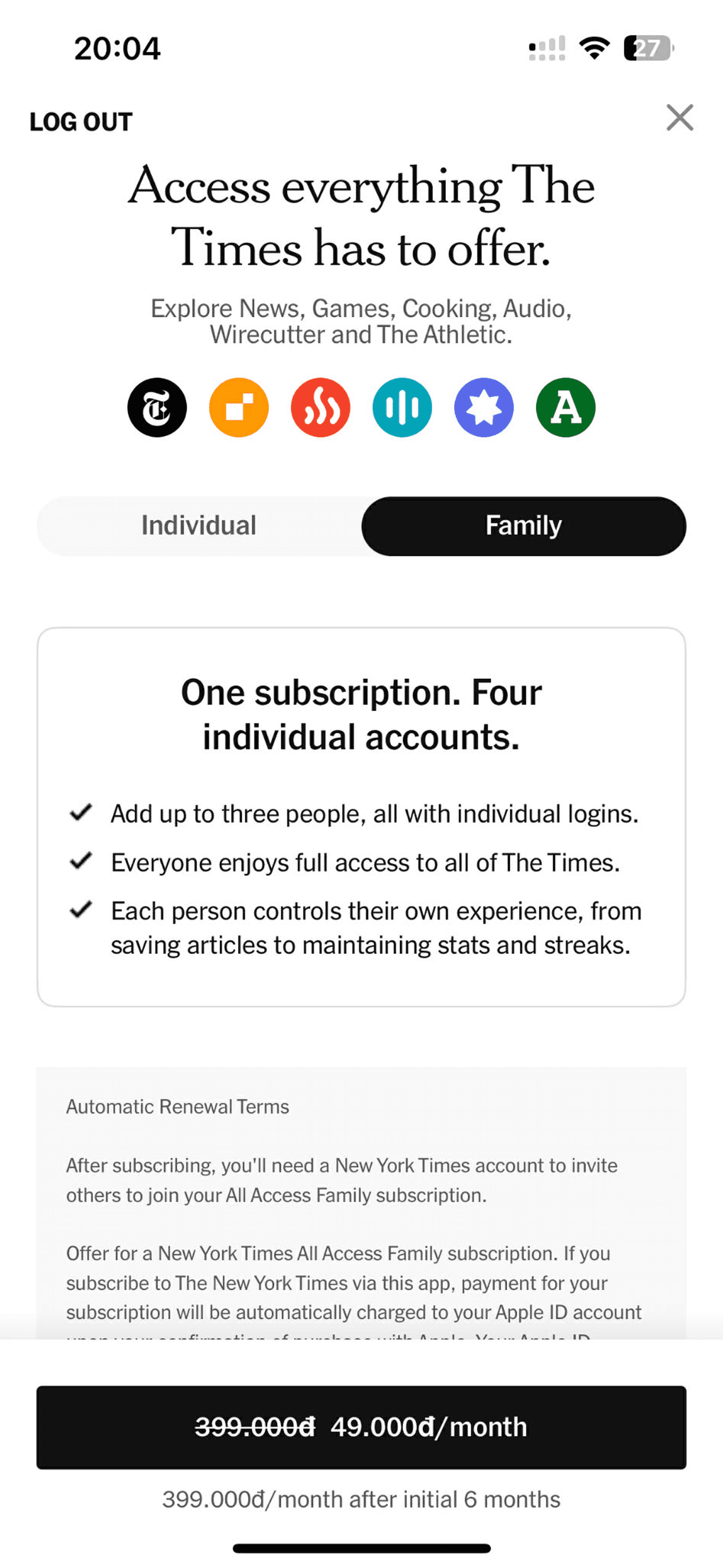
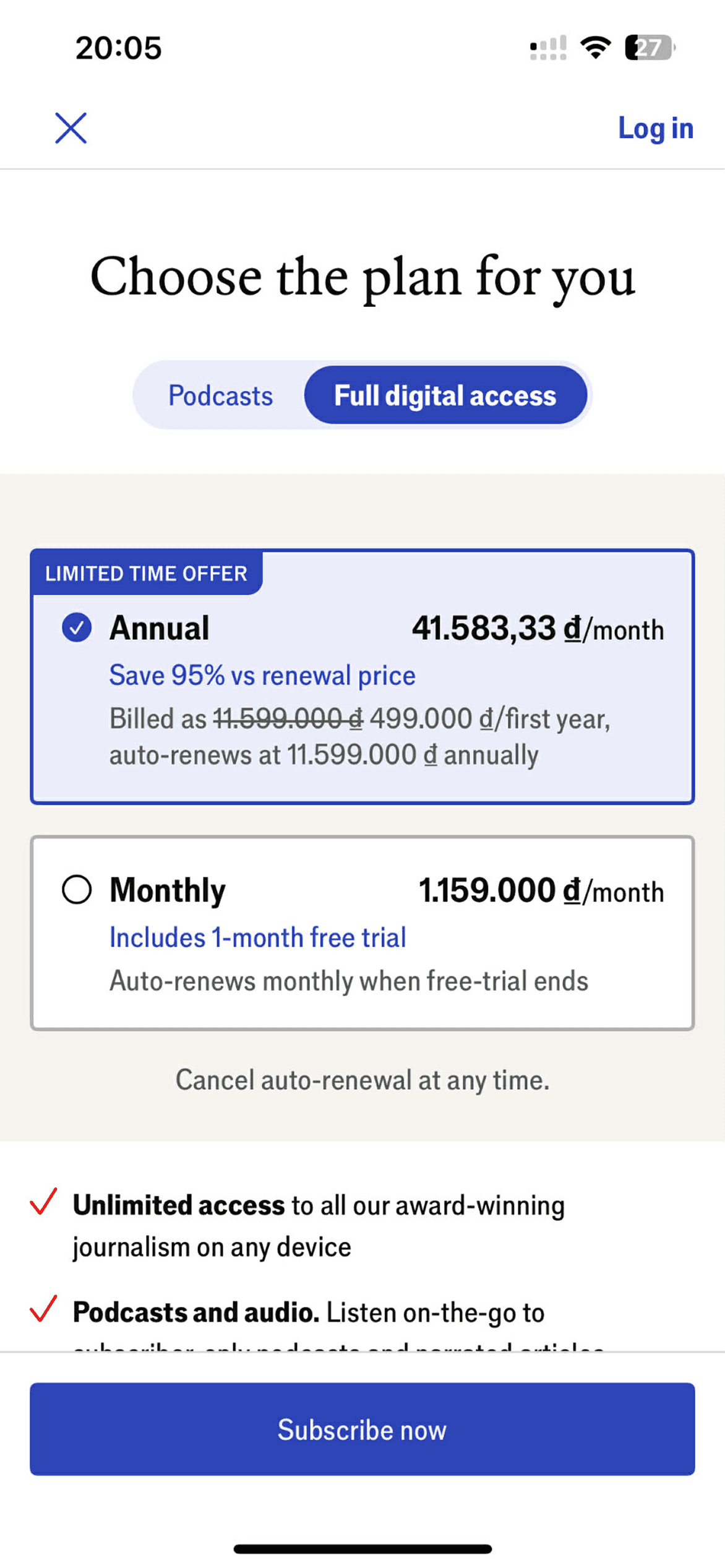
I analyzed leading reading apps from the US market to identify UX Patterns.

Blinkist


The NYT

Economist

The FT

Heatmap test
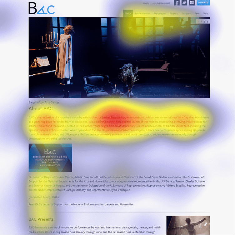
I performed a heatmap test on the current premium UI to see if the design was effectively guiding the user's eye toward our conversion goals.


36.6%
12.9%
1.0%


Hypothesis: Potential “Banner Blindness”
Source:
Heuristic evaluation
Based on heuristic principles, I evaluated the Premium screen to identify usability issues. This analysis highlights how the current layout & information hierarchy affect the user's subscription journey.
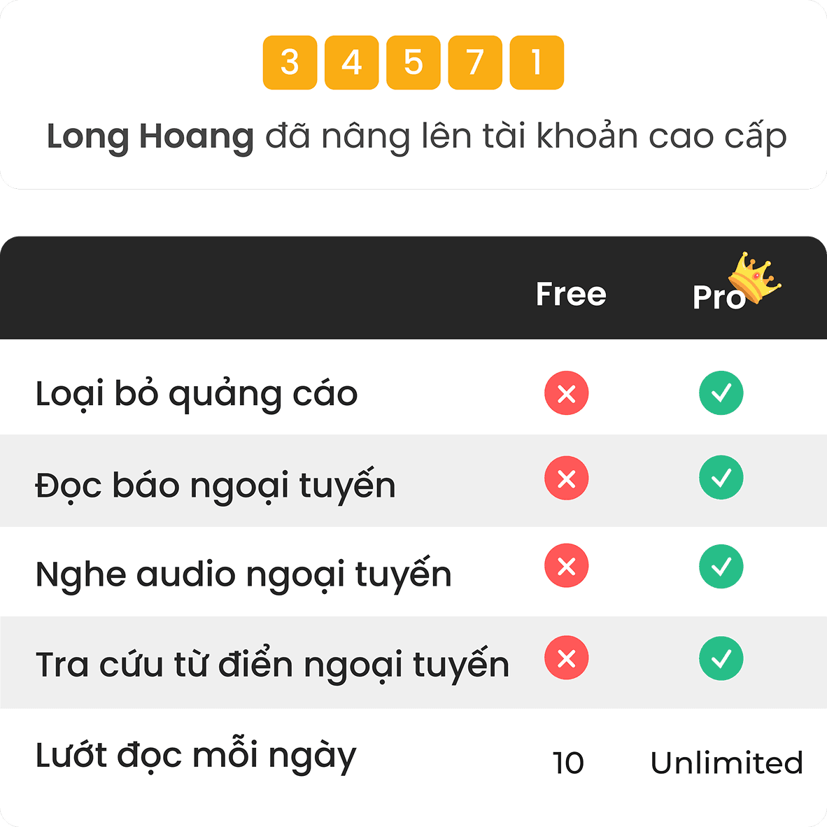
Cluttered information
Excessive information pushes key benefits below the fold, forcing users to scroll.

Overly prominent banner
It steals focus from the subscription plans, which users actually care about.

Low visibility of discount entry
Since users highly value deals, making it more prominent will better align with their intent.
I applied the JTBD framework to understand the specific job the user needs to get done when they encounter the subscription paywall.
Situation
Motivation
Expected outcomes
Problems
When I reach my daily limit of 3 free articles
I want continue reading without any interruption
A fast and transparent checkout process
Irrelevant info is distracting & adds no value to my decision
By synthesizing all the insights gathered, I transformed the identified pain points into three strategic design pillars to bridge the gap between user intent & conversion.
The redesigned UI prioritizes absolute clarity & rapid decision-making, transforming a cluttered interface into a conversion-optimized journey.

Optimized banner ratio 3:1
Reduce visual weight and save vertical space.

Horizontal pricing layout
Compact, scannable & distinct from banners


Sticky floating CTA
Instant access at any point while scrolling

Immediate value display
Shown upfront so users don't have to scroll
34.2%
10.8%
6.6%
The redesign led to a measurable improvement in user conversion, proving that a simplified interface significantly reduces the path to purchase.
+15%
Conversion rate indicates that the new UI effectively reduced friction in the subscription flow
+18%
First-open CR correlates with the increased visibility of pricing & benefits within the initial view
The upgrade process is fast and clear. Great support from the customer service team also
The premium plans are very clearly presented. I decided to support with a 1-year sub
I like the new layout, but the benefits could be even shorter for a quicker read.
Couldn’t find the discount entry at first and thought it wasn’t there.
A summary of the project’s core challenges & the strategic insights gained from balancing user experience with business growth.
Refine & shorten benefits to highlight only core values, ensuring instant understanding without cognitive load.
Replace the current discount entry with a more intuitive & visible solution for effortless discovery & usage