Todaii Japanese: Boosting user stickiness via integrated learning

Descriptions

  • Todaii Japanese is a news app designed to help users master the language through reading.

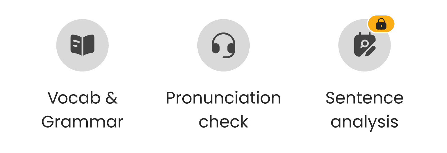
  • Integrates supporting features like JLPT exam, dictionary, lesson for a better study experience.

Problems

  • Continuously adding tools to transform passive reading into an active "Read-to-Learn" experience.

  • Too many features integrated into a single screen increased cognitive load.

  • The actual usage rate of new features on the article detail screen remains significantly low.

Rising Problems

Rising Problems

Rising Problems

After analyzing UX metrics via GA4, I found that both user stickiness & engagement faced a consistent decline over the five-month period from July 2024 to November 2024.

-17.1%

User stickiness (DAU/MAU) confirms fewer users are returning to the app daily

+12.4%

Bounce rate increase on news detail screen shows a rise in immediate exits

-0.21%

News detail engagement rate reflects a decline in feature usage during reading

To be more specific...

0.4%

Adoption rate for AI Analysis shows positive growth but remains far below the 5% target

-13.8%

Translation usage shows a decline in the app's most essential feature in news reading screen

Rising bounce rates and falling stickiness reveal a weakening user habit. Meanwhile, new AI features have yet to reach performance targets as core translation usage declines.

Rising bounce rates and falling stickiness reveal a weakening user habit. Meanwhile, new AI features have yet to reach performance targets as core translation usage declines.

Rising bounce rates and falling stickiness reveal a weakening user habit. Meanwhile, new AI features have yet to reach performance targets as core translation usage declines.

Objective & Approach

Objective & Approach

Objective & Approach

1. Primary goal

  • Improve user stickiness & engagement by optimizing the core news-reading experience.

2. What to do

  • Identify pain points on the current interface that lead to higher bounce rates & declining feature usage.

  • Propose improvements to help users focus on reading & easily access core tools without distraction.

Design Process

Design Process

Design Process

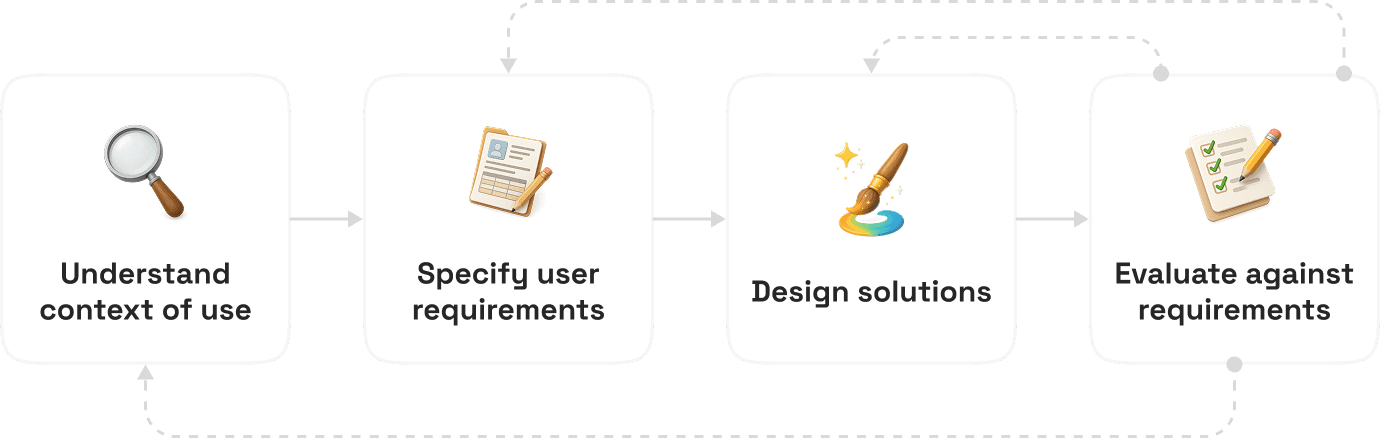
Since news reading is the core experience of Todaii Japanese, we adopted the User-Centered Design approach to ensure every optimization is rooted in proven behaviors. Rather than relying on assumptions, this process allows us to precisely align design changes with actual user data.
No time for lengthy process?

No time for lengthy process?

Secondary Research

Secondary Research

Secondary Research

Review mining

Users complained about a cluttered & suffocating reading screen. Many even requested features that already existed—like Sentence Analysis—simply because they were buried under excessive icons and fixed bars.

Too many buttons for a simple reading app. There’s barely any room left to read.

Too many buttons for a simple reading app. There’s barely any room left to read.

The reading screen is messy and overwhelming

The reading screen is messy and overwhelming

Where is the Sentence Analysis feature? Your ads say it’s live

Where is the Sentence Analysis feature? Your ads say it’s live

There’s barely any room left to read the news

There’s barely any room left to read the news

Previous Surveys & Interviews

Synthesis of previous data confirms that adding learning-support features was a reasonable direction, directly addressing the real needs of our users. However, engagement rate of these learning features are low. Why is that?

Listen to audio, read the news, then do the quiz to check my understanding

Listen to audio, read the news, then do the quiz to check my understanding

I wanna update news while improving my Japanese daily

I wanna update news while improving my Japanese daily

Love the diverse and high-quality news content here!

Love the diverse and high-quality news content here!

Great for reading, but I need more grammar support

Great for reading, but I need more grammar support

80%

Users learn Japanese for entertainment & hobbies, followed by career growth (60%)

Users wanted learning-support features, but why didn’t they use them after release?

Users wanted learning-support features, but why didn’t they use them after release?

Maybe it’s not because of WHAT we design? But HOW we design it!

Maybe it’s not because of WHAT we design? But HOW we design it!

Maybe it’s not because of WHAT we design? But HOW we design it!

Primary Research

Primary Research

Primary Research

Heuristic evaluation

A usability audit where I evaluated the UI against industry-standard principles (Heuristics). By doing this, I could pinpoint UX bottlenecks that were causing user frustration on the reading screen.

Feature overload

Excessive buttons clutter the screen, distracting users from their primary reading goal.

Redundant information

Grammar and vocab lists are duplicated in the header & after the article.

Ambiguous icons

Abstract features are hard to represent with icons, making users miss existing tools.

Confusing buttons

Similar translation buttons placed side-by-side creates confusion for users.

12 Features in just 1 screen?

12 Features in just 1 screen?

12 Features in just 1 screen?

Features compete for attention & create cognitive load, leaving no clear focus for users

Features compete for attention & create cognitive load, leaving no clear focus for users

Miller's Law: 7 ± 2 “Cognitive Load”

The current UI exceeds the human capacity to process information. This overload forces users to spend too much mental effort, making it harder to find & focus on core features.

The current UI exceeds the human capacity to process information. This overload forces users to spend too much mental effort, making it harder to find & focus on core features.

User Persona

User Persona

User Persona

Based on past interviews and surveys, I identified two core personas: The Casual Reader, who needs a clean interface for quick news, and The Study-oriented Reader, who requires deep access to study tools for language mastery.

Casual Reader

Casual Reader

I wanna catch up on the news quickly

I wanna catch up on the news quickly

Behavior

Behavior

  • Skims through headlines and picks 1-2 interesting articles during lunch breaks

  • Uses quick translation for difficult words but rarely saves them

Need

Need

  • Fast and natural translations to understand the news quickly

  • Simple, clean interface that doesn't distract from the reading experience

Pain points

Pain points

  • Why are there so many buttons blocking my view?

  • The screen is so messy and crowded. Reading can’t be more mentally exhausting!

Study-oriented Reader

Study-oriented Reader

Every article is a chance to learn

Every article is a chance to learn

Behavior

Behavior

  • Constantly scrolls to the bottom to check and save words or grammar points

  • Spends a long time on one article to analyze difficult structures

Need

Need

  • A way to quickly jump from reading a sentence to practicing it

  • Save and memorize new words I encounter in each articles

Pain points

Pain points

  • I can’t find the grammar analysis feature they advertise

  • Why would I care about commenting on the news?

User Journey Mapping

User Journey Mapping

User Journey Mapping

I used UJM to analyze the news-reading experience of each persona. Casual readers are distracted by too many study tools, while study-oriented group struggles to find & collect new knowledge due to a cluttered, unclear interface. The long, cluttered layout makes both groups feel exhausted, causing them to quit the app early.

Stage

Stage

Entry

Entry

Reading

Reading

Exit

Exit

Actions

Actions

Actions

Skims the vocab percentage bar

Skims the vocab percentage bar

Skims the vocab percentage bar

Listens to Audio and uses translation for hard parts

Listens to Audio and uses translation for hard parts

Listens to Audio and uses translation for hard parts

Saves to favorites & looks for next articles

Saves to favorites & looks for next articles

Saves to favorites & looks for next articles

Pains

Pains

Pains

Fixed header icons are unclear. Accidentally clicking them opens unneeded study tools

Fixed header icons are unclear. Accidentally clicking them opens unneeded study tools

Fixed header icons are unclear. Accidentally clicking them opens unneeded study tools

Too many academic buttons on the screen distract from the news & shrink the reading space

Too many academic buttons on the screen distract from the news & shrink the reading space

Too many academic buttons on the screen distract from the news & shrink the reading space

Must scroll past a long section (Quiz, Vocab, Grammar) to find related articles

Must scroll past a long section (Quiz, Vocab, Grammar) to find related articles

Must scroll past a long section (Quiz, Vocab, Grammar) to find related articles

Delights

Delights

Delights

Sticky audio bar is always ready for control while scrolling

Sticky audio bar is always ready for control while scrolling

Sticky audio bar is always ready for control while scrolling

Translation helps understand the news instantly

Translation helps understand the news instantly

Translation helps understand the news instantly

Quickly catching up on a high volume of information

Quickly catching up on a high volume of information

Quickly catching up on a high volume of information

Emotions

Emotions

Emotions

Curious but overwhelmed by unknown icons

Curious but overwhelmed by unknown icons

Curious but overwhelmed by unknown icons

Focused on news but feels annoyed by UI clutter

Focused on news but feels annoyed by UI clutter

Focused on news but feels annoyed by UI clutter

Informed but likely to bounce due to long scrolling

Informed but likely to bounce due to long scrolling

Informed but likely to bounce due to long scrolling

Opportunities

Opportunities

Opportunities

Customed view allows users to hide all specialized icons if they only want to read

Customed view allows users to hide all specialized icons if they only want to read

Customed view allows users to hide all specialized icons if they only want to read

Minimalist view that prioritizes text & audio. Only showing study tools when requested

Minimalist view that prioritizes text & audio. Only showing study tools when requested

Minimalist view that prioritizes text & audio. Only showing study tools when requested

Remove unnecessary information to help users quickly find related articles & keep the reading flow

Remove unnecessary information to help users quickly find related articles & keep the reading flow

Remove unnecessary information to help users quickly find related articles & keep the reading flow

Casual reader

Casual reader

Quickly update daily news via reading or listening

Quickly update daily news via reading or listening

Stage

Stage

Analysis

Analysis

Interaction

Interaction

Review

Review

Actions

Actions

Actions

Try to find the sentence analysis feature. Clicks different icons hoping to find the right one

Try to find the sentence analysis feature. Clicks different icons hoping to find the right one

Try to find the sentence analysis feature. Clicks different icons hoping to find the right one

Read sentence analysis result. Uses AI Discussion feature for speaking practice

Read sentence analysis result. Uses AI Discussion feature for speaking practice

Read sentence analysis result. Uses AI Discussion feature for speaking practice

Complete short quiz. Scrolls down to check the vocab & grammar lists at the end

Complete short quiz. Scrolls down to check the vocab & grammar lists at the end

Complete short quiz. Scrolls down to check the vocab & grammar lists at the end

Pains

Pains

Pains

Header icons are confusing. Users waste time guessing

Header icons are confusing. Users waste time guessing

Header icons are confusing. Users waste time guessing

Tools feels disconnected. Users feel lost trying to figure out a logical study flow

Tools feels disconnected. Users feel lost trying to figure out a logical study flow

Tools feels disconnected. Users feel lost trying to figure out a logical study flow

The vocab and grammar lists are too long. Users don't know where to start

The vocab and grammar lists are too long. Users don't know where to start

The vocab and grammar lists are too long. Users don't know where to start

Delights

Delights

Delights

Eventually found the right tools after multiple attempts

Eventually found the right tools after multiple attempts

Eventually found the right tools after multiple attempts

Deep understanding of grammar structures in real-world contexts

Deep understanding of grammar structures in real-world contexts

Deep understanding of grammar structures in real-world contexts

Found & saved some useful vocab and grammar into notebook

Found & saved some useful vocab and grammar into notebook

Found & saved some useful vocab and grammar into notebook

Emotions

Emotions

Emotions

Confused & frustrated when finding the right tool

Confused & frustrated when finding the right tool

Confused & frustrated when finding the right tool

Engaged in quality content but unsupported

Engaged in quality content but unsupported

Engaged in quality content but unsupported

Overwhelmed by volume

Overwhelmed by volume

Overwhelmed by volume

Opportunities

Opportunities

Opportunities

Create study mode in which study tools are easy to identify

Create study mode in which study tools are easy to identify

Create study mode in which study tools are easy to identify

Group features into a systematic toolkit with a guided flow

Group features into a systematic toolkit with a guided flow

Group features into a systematic toolkit with a guided flow

Let users choose what to learn instead of showing everything

Let users choose what to learn instead of showing everything

Let users choose what to learn instead of showing everything

Study-oriented

Study-oriented

Deeply analyze articles to master Japanese language skills

Deeply analyze articles to master Japanese language skills

Come up with Solutions

Come up with Solutions

Come up with Solutions

Based on user behaviors & needs found in previous research, these solutions directly address actual struggles to create a simpler, more natural experience.

As is: Todaii wants to serve readers & learners simultaneously, but ends up failing both

To be: Split users into two distinct paths based on their goals: Read mode & Study mode

To be: Split users into two distinct paths based on their goals: Read mode & Study mode

As is: 12 features in one screen increase cognitive load & breaks the reading flow

To be: Group and show features only when needed, so users can digest information easier

To be: Group and show features only when needed, so users can digest information easier

As is: Listing all vocab/grammar at once is overwhelming, so users don't know where to start

As is: Listing all vocab/grammar at once is overwhelming, so users don't know where to start

To be: Let users choose what to learn and guide them through a personalized path.

To be: Let users choose what to learn and guide them through a personalized path.

Read

Read

Update daily news

Update daily news

Study

Study

Learn from articles

Learn from articles

Chunking Content: Progressive Disclosure

I grouped 12 features based on 2 intents: Reading & Studying. Instead of overwhelming users, the UI only shows the specific features they need, when they need them.

I grouped 12 features based on 2 intents: Reading & Studying. Instead of overwhelming users, the UI only shows the specific features they need, when they need them.

Source:

Card Sorting

Card Sorting

Card Sorting

A research method used to organize information effectively. I collaborated with PM & Japanese content specialist to categorize 12 features based on user intent, aiming to simplify the interface into 2 clear paths: Read & Study.

Read

Study

Flow Chart

Flow Chart

Flow Chart

I designed a structured 3-step learning path: Vocabulary, Grammar, and Sentences. By combining personalized selection with interactive practice, this flow ensures an active & tailored learning experience.

Key Improvements

Key Improvements

Key Improvements

Showcasing side-by-side UI enhancements to highlight significant UX upgrades from the previous version.

Read
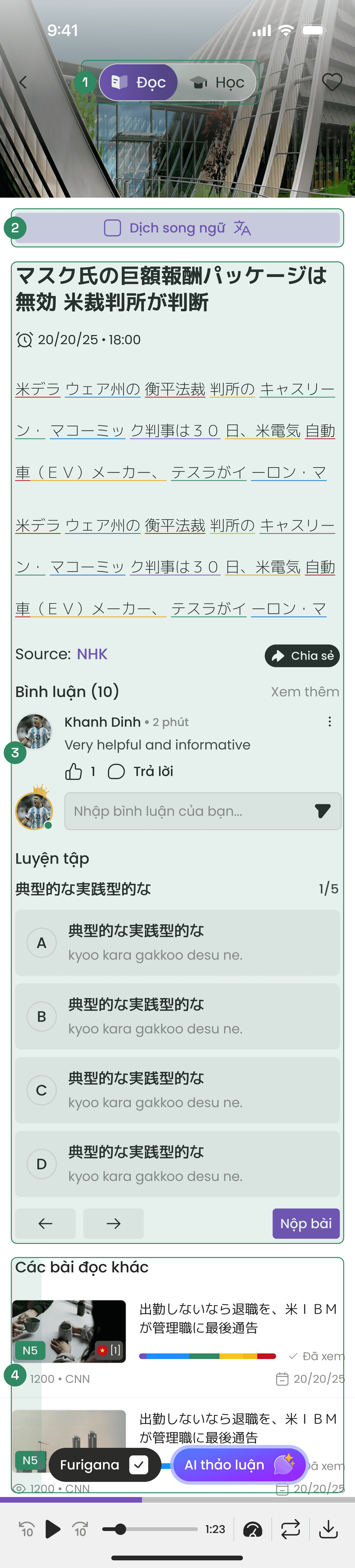
1. Fixed Mode Switcher

1. Fixed Mode Switcher

Seamless switching between Read & Learn modes based on user goals

Seamless switching between Read & Learn modes based on user goals

2. Translation Toggle

2. Translation Toggle

Remove confusion & make it easy for readers to recognize and toggle translations

Remove confusion & make it easy for readers to recognize and toggle translations

  1. Content-Focused UI

  1. Content-Focused UI

Moved learning tools to study mode to ensure a distraction-free reading experience

Moved learning tools to study mode to ensure a distraction-free reading experience

  1. Seamless Flow

  1. Seamless Flow

Removed vocabulary lists to bring the next article closer for a continuous reading flow

Removed vocabulary lists to bring the next article closer for a continuous reading flow

Study

#1: First-time entry

Shows the vocab list to start the first lesson instantly
1. Welcome Animation

1. Welcome Animation

Tomo mascot introduces the new study mode to spark interest & motivate learners

Tomo mascot introduces the new study mode to spark interest & motivate learners

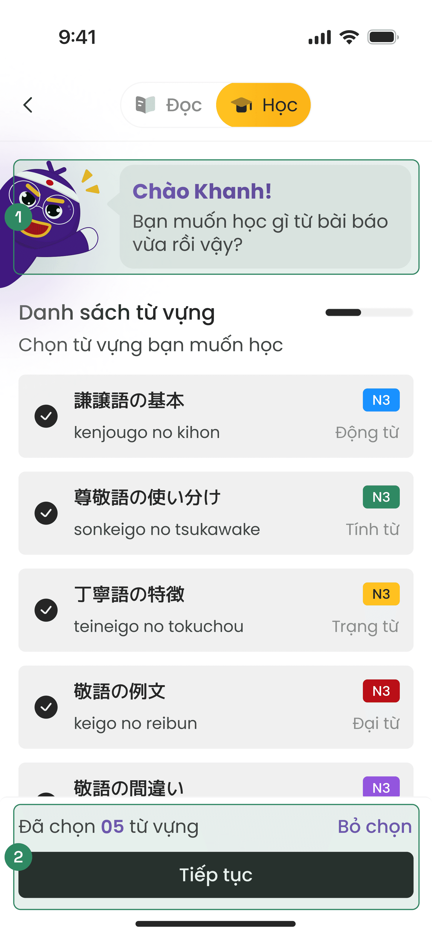
2. Vocabulary Selection

2. Vocabulary Selection

Users can select their own vocabulary to study with a 5-item limit to prevent overload

Users can select their own vocabulary to study with a 5-item limit to prevent overload

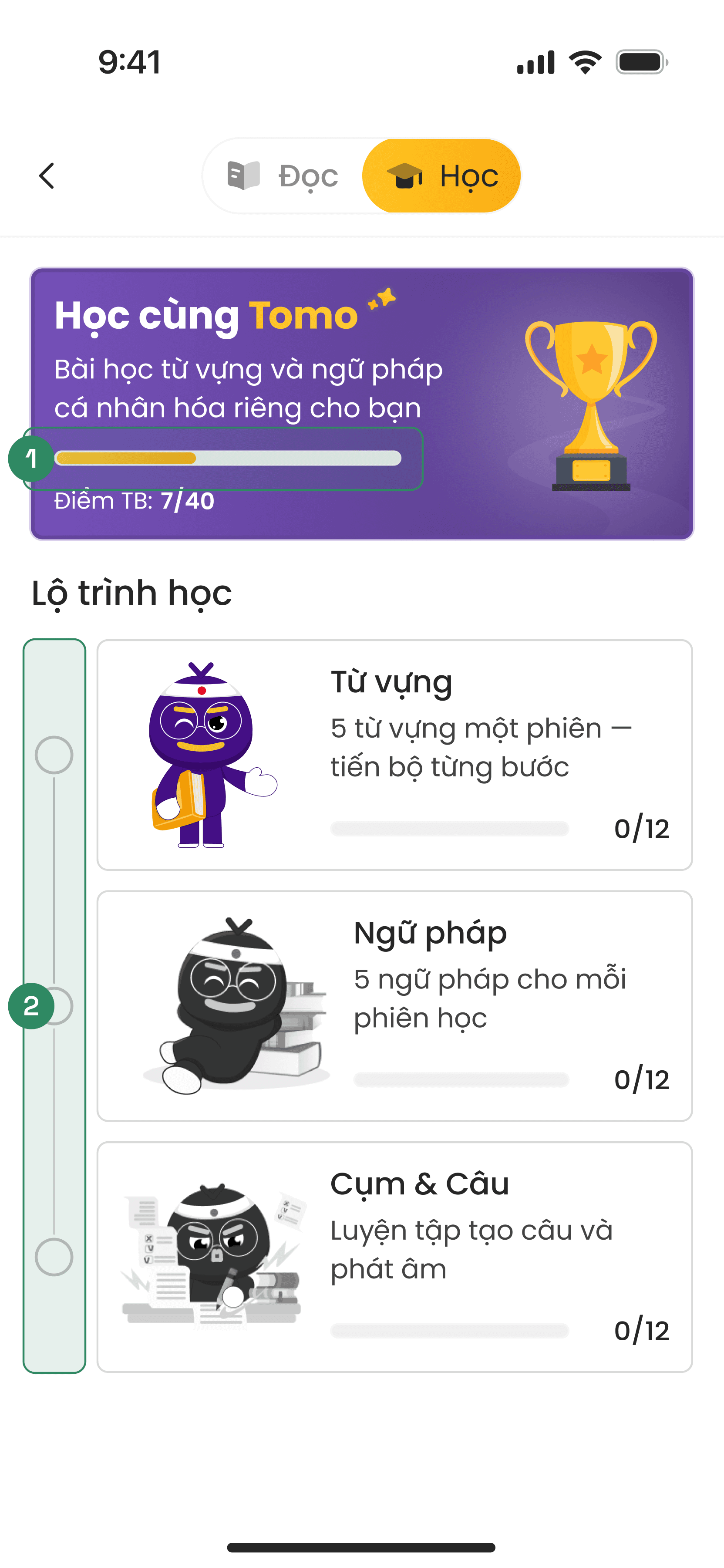
#2: Returning Access

Displays the roadmap that allows users to resume lessons

  1. Learning Progress Stats

  1. Learning Progress Stats

Visualizes study progress to motivate users via the goal gradient effect

Visualizes study progress to motivate users via the goal gradient effect

  1. Step-by-Step Roadmap

  1. Step-by-Step Roadmap

Breaks lessons into clear, sequential stages to guide users through a structured flow

Breaks lessons into clear, sequential stages to guide users through a structured flow

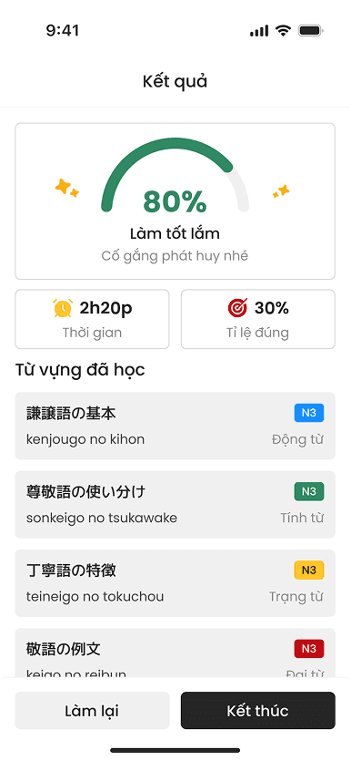
A few other screens

A quick look at various screens within the new study flow.

Final Impact

Final Impact

Final Impact

As this feature is still currently in development, we plan to evaluate its success post-launch using a combination of quantitative & qualitative data to ensure both efficiency & user satisfaction.

Quantitative data

Quantitative data

Adoption rate (Goal: 15%)

Evaluate the appeal of the study mode entry point and its effectiveness in converting readers into active learners

Time on screen (Goal: +25%)

To measure how the integrated reading and learning flow drives deeper engagement

User stickiness (Goal: +20%)

To test if the bite-sized roadmap successfully builds a daily study habit

Qualitative data

Qualitative data

User reviews

To understand how users feel about the new study flow and if they find it truly helpful

Survey

Actively reach more users and collect a large volume of feedback on how the new feature meets their needs

Screen recordings

Observe real behavior & see if users struggle with the new solution, allowing us to identify & fix issues early

Key Takeaways

Key Takeaways

Key Takeaways

A quick look at the real struggles of balancing what the business wants versus what actually works for the user, & the lessons I picked up along the way.

Challenges

Challenges

Challenges

  • Feature visibility: PM requested all new features be fixed and prominent on the reading screen. This created visual competition, where every new addition overshadowed the previous ones.

  • Feature visibility: PM requested all new features be fixed and prominent on the reading screen. This created visual competition, where every new addition overshadowed the previous ones.

  • Balancing priorities: Aligning with PM & Marketing to establish a clear hierarchy, ensuring that making one feature stand out doesn't clutter the overall experience.

  • Balancing priorities: Aligning with PM & Marketing to establish a clear hierarchy, ensuring that making one feature stand out doesn't clutter the overall experience.

Lesson learned

Lesson learned

Lesson learned

  • Context over placement: While choosing the right solution is important, how that solution is integrated into the user flow is even more critical.

  • Context over placement: While choosing the right solution is important, how that solution is integrated into the user flow is even more critical.

  • Evidence-based persuasion: Leveraging proven UX laws helps ground design choices in logic, making arguments more objective and professional when aligning with stakeholders.

  • Evidence-based persuasion: Leveraging proven UX laws helps ground design choices in logic, making arguments more objective and professional when aligning with stakeholders.

Thank you for
watching!

Thank you for
watching!

Thank you for
watching!

Interested in working with me?

Interested in working with me?

Interested in working with me?

Other Projects

Other Projects

Other Projects

Curious to see more? Check out these case studies

Curious to see more? Check out these case studies

Mobile App

6 mins read

Todaii German: Enhancing premium CR for market expansion

0%

0%

Purchase CR

Mobile App

6 mins read

Todaii German: Enhancing premium CR for market expansion

0%

0%

Purchase CR

Mobile App

6 mins read

Todaii German: Enhancing premium CR for market expansion

0%

0%

Purchase CR

Mobile App

6 mins read

Hanzii Redesign: Drive sustainable growth by aligning revenue & retention

0%

0%

Purchase volume

Mobile App

6 mins read

Hanzii Redesign: Drive sustainable growth by aligning revenue & retention

0%

0%

Purchase volume

Mobile App

6 mins read

Hanzii Redesign: Drive sustainable growth by aligning revenue & retention

0%

0%

Purchase volume

Create a free website with Framer, the website builder loved by startups, designers and agencies.